
收藏该字体
已收藏
(已有0人收藏)
分享返现
Cosmiqua Pro Bold
风格
价格
¥
请联系客服获取报价
¥18550.00
官方售价
-
当前汇率
1
代购佣金

¥-
代扣税费
¥-
增值税
¥-
服务承诺
 正版商用
正版商用
 官方授权
官方授权
 正规发票
正规发票
正版商用
官方授权
正规发票
发货时间
3个工作日
3个工作日 许可数量
咨询授权

18610955775
service@fontgoods.com
A-
A+
字体颜色
背景颜色
重置
Cosmiqua Pro Bold
Cosmiqua Pro Heavy Italic
Cosmiqua Pro Light
Cosmiqua Pro Heavy
Cosmiqua Pro Semibold Italic
Cosmiqua Pro Regular
Cosmiqua Pro Italic
Cosmiqua Pro Bold Italic
Cosmiqua Pro Light Italic
Cosmiqua Pro Semibold
字体描述
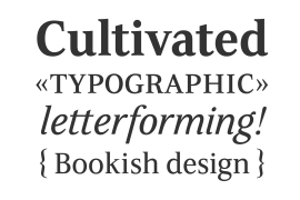
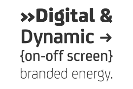
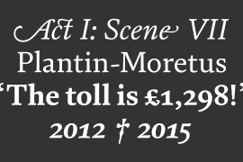
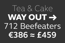
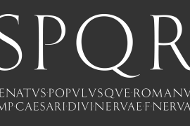
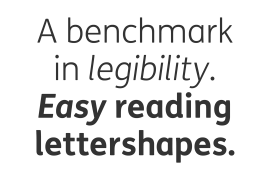
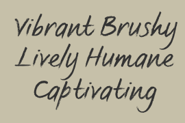
Cosmiqua is a lively serif family from Linotype's Type Director, Akira Kobayashi. Inspired by advertising design from the 1950s, Kobayashi began to closely examine his favorite letterforms from this genre, particularly those headline faces that appear to live in the space between formal italic types and casual handwriting. These letterforms exude a certain hope for the future, and also appear to be a little odd, or kitschy, to our 21st century eyes. Yet the serifs and terminals on these letters do not let go of one's attention.
On further examination, Kobayashi found these same traits in even older faces, particularly 19th century English advertising types. Assuming the spirit of these diverse sources into himself (one typeface in particular, Miller & Richard's Caledonian Italic, was quite influential) Kobayashi drew Cosmiqua.
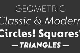
Cosmiqua is an amalgamation of the French cosmique," meaning cosmic, and "Antiqua," the German term for serif type. In other words, this is a cosmic serif face; a typeface for the future, as the future was seen in the 1950s.
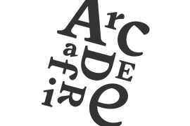
Kobayashi first drew the Italic weights of Cosmiqua, refining his favorite lowercase forms (x and y), as well as creating sublime ball terminals on the A and N. Only later did he move on to the upright, Roman forms. Although Cosmiqua was originally conceived for display uses, it is a serviceable text face as well.
Cosmiqua has five weights, each with an Italic (Light, Regular, Semibold, Bold, and Heavy)."
On further examination, Kobayashi found these same traits in even older faces, particularly 19th century English advertising types. Assuming the spirit of these diverse sources into himself (one typeface in particular, Miller & Richard's Caledonian Italic, was quite influential) Kobayashi drew Cosmiqua.
Cosmiqua is an amalgamation of the French cosmique," meaning cosmic, and "Antiqua," the German term for serif type. In other words, this is a cosmic serif face; a typeface for the future, as the future was seen in the 1950s.
Kobayashi first drew the Italic weights of Cosmiqua, refining his favorite lowercase forms (x and y), as well as creating sublime ball terminals on the A and N. Only later did he move on to the upright, Roman forms. Although Cosmiqua was originally conceived for display uses, it is a serviceable text face as well.
Cosmiqua has five weights, each with an Italic (Light, Regular, Semibold, Bold, and Heavy)."
许可类型
|
许可名称
|
许可描述
|
许可协议原文(英文)
|
|
|---|---|---|---|
|
桌面
|
在Windows或macOS安装字体,在桌面应用程序使用字体(包括:Photoshop、Illustrator、CorelDRAW、Word等),创建和打印文档以及静态图像。多数情况下,可在徽标/商标、产品包装、宣传物料、新媒体、网站、应用程序当中使用这些图像。
|
授权流程
线下授权
提交需求
联系客服,根据需求出具授权方案(报价单)
签订合同
Monotype与客户签订授权合同
支付订单
通过对公转账、国际电汇等线下途径支付给Monotype
开具发票
Monotype开具增值税发票
授权完成
Monotype出具授权证明(授权合同/授权证书)和发送字体文件
官方授权
本店所有字体均由Monotype官方授权字谷网代理销售
授权证明
Monotype官方出具授权证明
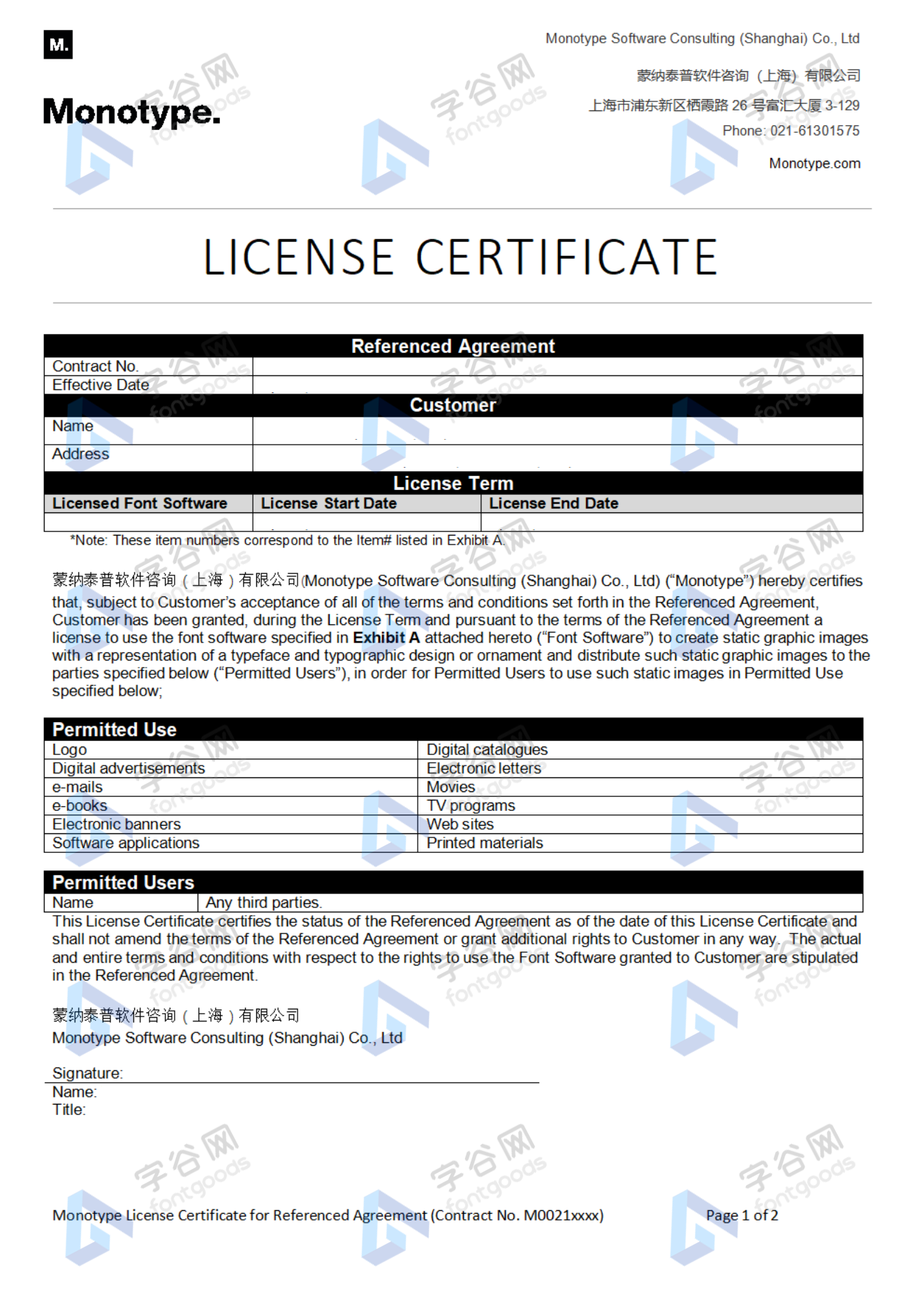
正规发票
每笔产生实际支付的订单都能在线申请开具增值税发票。
发
票
样
本
票
样
本

开票流程
1.在订单列表内点击“申请开票”
2.选择或新增您的“发票抬头”
3.提交申请
发票类型
1. 增值税普通发票,税率:6%
2. 增值税专用发票,税率:6%
发票内容:信息技术服务费
注:电子发票发送到您的电子邮箱,电子票据与纸质票据具有同等法律效力。
常见问题
1.广告公司为客户设计作品由谁购买字体授权
通常字库软件使用许可的“被许可方”应为设计方案的最终使用方,因此设计方案的业主单位必须获得所使用字体的相关授权,此外有些授权方式(如桌面授权)规定了使用终端的数量,那么所有使用该字体进行设计或者修改方案的计算机均需要获得授权。
2.如何帮客户购买授权
您提交订单时可以选择或者新增“被许可方”信息,在“被许可方”的表单内填写您的客户信息即可。
3.怎么安装字体
Windows系统:直接将字体文件复制到C:\Windows\Fonts,或者鼠标右键单击字体文件,选择“安装”即可;Mac系统:双击字体文件-点击安装,或者打开“应用程序”-“字体册”,将字体拖进去即可。
4.字体安装后在PS等软件中找不到怎么办
由于操作系统或者软件版本的原因,如果您在软件中找不到安装的字体,建议您先重启系统,该字体在列表中显示的可能为中文或英文名称,请您认真查找,只要字体安装成功,字体列表里就一定存在该字体。
5.支付过程出现风险提示怎么办
使用微信、支付宝等第三方支付工具进行大额支付时,有可能触发风险提示,请根据以下方法进行操作,您也可以通过企业对公转账的方式支付大额订单;

字体信息
这里还有


相关标签
猜你喜欢


 京公网安备11010802038756号