


 正版商用
正版商用
 官方授权
官方授权
 正规发票
2日(节假日顺延)
正规发票
2日(节假日顺延)

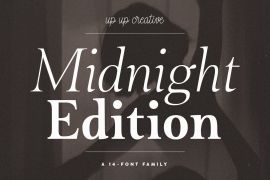
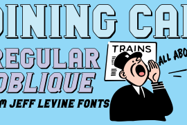
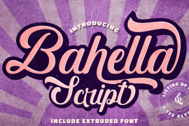
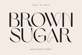
字体描述
Originally designed in 1996, Mrs Eaves was Zuzana Licko’s first attempt at the design of a traditional typeface. It was styled after Baskerville, the famous transitional serif typeface designed in 1757 by John Baskerville in Birmingham, England. Mrs Eaves was named after Baskerville’s live in housekeeper, Sarah Eaves, whom he later married. One of Baskerville’s intents was to develop typefaces that pushed the contrast between thick and thin strokes, partially to show off the new printing and paper making techniques of his time. As a result his types were often criticized for being too perfect, stark, and difficult to read. Licko noticed that subsequent interpretations and revivals of Baskerville had continued along the same path of perfection, using as a model the qualities of the lead type itself, not the printed specimens. Upon studying books printed by Baskerville at the Bancroft Library in Berkeley, Licko decided to base her design on the printed samples which were heavier and had more character due to the imprint of lead type into paper and the resulting ink spread. She reduced the contrast while retaining the overall openness and lightness of Baskerville by giving the lower case characters a wider proportion. She then reduced the x-height relative to the cap height to avoid increasing the set width. There is something unique about Mrs Eaves and it’s difficult to define. Its individual characters are at times awkward looking—the W being narrow, the L uncommonly wide, the flare of the strokes leading into the serifs unusually pronounced. Taken individually, at first sight some of the characters don’t seem to fit together. The spacing is generally too loose for large bodies of text, it sort of rambles along. Yet when used in the right circumstance it imparts a very particular feel that sets it clearly apart from many likeminded types. It has an undefined quality that resonates with people. This paradox (imperfect yet pleasing) is perhaps best illustrated by design critic and historian Robin Kinross who has pointed out the limitation of the “loose” spacing that Licko employed, among other things, yet simultaneously designated the Mrs Eaves type specimen with an honorable mention in the 1999 American Center for Design competition. Proof, perhaps, that type is best judged in the context of its usage. Even with all its shortcomings, Mrs Eaves has outsold all Emigre fonts by twofold. On MyFonts, one of the largest on-line type sellers, Mrs Eaves has been among the 20 best selling types for years, listed among such classics as Helvetica, Univers, Bodoni and Franklin Gothic. Due to its commercial and popular success it has come to define the Emigre type foundry. While Licko initially set out to design a traditional text face, we never specified how Mrs Eaves could be best used. Typefaces will find their own way. But if there’s one particular common usage that stands out, it must be literary—Mrs Eaves loves to adorn book covers and relishes short blurbs on the flaps and backs of dust covers. Trips to bookstores are always a treat for us as we find our Mrs Eaves staring out at us from dozens of book covers in the most elegant compositions, each time surprising us with her many talents. And Mrs Eaves feels just as comfortable in a wide variety of other locales such as CD covers (Radiohead’s Hail to the Thief being our favorite), restaurant menus, logos, and poetry books, where it gives elegant presence to short texts. One area where Mrs Eaves seems less comfortable is in the setting of long texts, particularly in environments such as the interiors of books, magazines, and newspapers. It seems to handle long texts well only if there is ample space. A good example is the book /CD/DVD release The Band: A Musical History published by Capitol Records. Here, Mrs Eaves was given appropriate set width and generous line spacing. In such cases its wide proportions provide a luxurious feel which invites reading. Economy of space was not one of the goals behind the original Mrs Eaves design. With the introduction of Mrs Eaves XL, Licko addresses this issue. Since Mrs Eaves is one of our most popular typefaces, it’s not surprising that over the years we've received many suggestions for additions to the family. The predominant top three wishes are: greater space economy; the addition of a bold italic style; and the desire to pair it with a sans design. The XL series answers these requests with a comprehensive set of new fonts including a narrow, and a companion series of Mrs Eaves Sans styles to be released soon. The main distinguishing features of Mrs Eaves XL are its larger x-height with shorter ascenders and descenders and overall tighter spacing. These additional fonts expand the Mrs Eaves family for a larger variety of uses, specifically those requiring space economy. The larger x-height also allows a smaller point size to be used while maintaining readability. Mrs Eaves XL also has a narrow counterpart to the regular, with a set width of about 92 percent which fulfills even more compact uses. At first, this may not seem particularly narrow, but the goal was to provide an alternative to the regular that would work well as a compact text face while maintaining the full characteristics of the regular, rather than an extreme narrow which would be more suitable for headline use. Four years in the making, we're excited to finally let Mrs Eaves XL find its way into the world and see where and how it will pop up next.
许可类型
|
许可名称
|
许可描述
|
许可协议原文(英文)
|
|
|---|---|---|---|
|
桌面(desktop)
|
在Windows或macOS安装字体,在桌面应用程序使用字体(包括:Photoshop、Illustrator、CorelDRAW、Word等),创建和打印文档以及静态图像。多数情况下,可在徽标/商标、产品包装、宣传物料、新媒体、网站、应用程序当中使用这些图像。
|
字形展示
授权流程
线上全程自助授权
正版承诺
该字体由福州字谷科技有限公司代购

授权证明
官方出具授权证明,可在“个人中心-我的订单”查看或下载(付款后2个工作日内发货)
正规发票
每笔产生实际支付的订单都能在线申请开具增值税发票。
票
样
本

开票流程
1.在订单列表内点击“申请开票”
2.选择或新增您的“发票抬头”
3.提交申请
发票类型
1. 增值税普通发票,税率:1%
2. 增值税专用发票,税率:1%
发票内容:信息技术服务费
注:电子发票发送到您的电子邮箱,电子票据与纸质票据具有同等法律效力。
常见问题
1.代购商品已下架或暂时无价格怎么办
代购商品页面出现“代购方商品已下架”、“暂时无价格”、“正在更新价格”等提示,是因为远程服务器读取失败造成的,请您联系在线客服或微信客服18610955775获取详细报价。
2.海外字体常见的授权方式
桌面授权(Desktop)
“桌面”指的是计算机,桌面授权允许您将字体安装在计算机上,用于离线设计用途,包括设计Logo、海报、商品、杂志等,比如您在计算机上使用字体设计的静态图片是允许您随意传播的(不论线上、线下都可以使用);但不能将字体文件以任何形式嵌入您的作品,也就是说字体文件不能离开您的计算机,比如说将字体转换格式后嵌入网页或者在PPT中嵌入字体后进行传播都是不允许的;需要注意的是有些版权方可能会额外规定不允许将字体用于设计LOGO等指定用途,具体以版权方的规定为准。
该授权通常按用户数量进行授权,用户数指的是有可能安装该字体的电脑数量;桌面授权一般是永久有效的,如有指定年限我们的购买页面都会有所提示;授权有效期内设计的作品是可以永久使用的,但授权有效期外还需要继续使用字体进行设计的话需要重新购买授权。
网页授权(Webfont)
网页授权顾名思义就是允许将字体文件嵌入到各类网页中的一种授权方式,不论字体文件是否经过转换格式,也不论是完整嵌入或是部分嵌入,字体文件以任何形式嵌入网页都需要取得该授权。
不同版权方对于网页授权的售卖方式有所差别,除了按授权期限售卖之外,一般还会规定授权期限内的总浏览量或每月浏览量,您可以根据您的网站需求选择购买,购买授权后若遇浏览量超出预期的可重复购买。
应用授权(App)
应用授权允许您将字体文件嵌入到您开发或运营的APP中,不论是游戏APP、教育APP、音乐APP,任何APP只要嵌入了字体文件都需要取得该授权。
应用授权可按照授权期限、装机量、APP数量等多种形式售卖。
电子书授权(ePub)
电子书授权允许将字体文件嵌入到电子出版物中,但是运行电子出版物的操作系统中不能安装字体软件。
该授权可按照授权期限、书目数量、设备总量、浏览量等多种形式售卖。
服务器授权(Server)
服务器授权允许您将字体以无法被提取的方式安装在被授权的服务器上,但不能在任何其他计算机或处理单元上安装字体。
该授权可按照授权期限、CPU核心数、客户端数量等多种形式售卖。
数字广告授权(Digital Ads)
数字广告授权允许您访问、下载和使用Web字体工具包中提供的Web字体,以便创建数字广告,但是仅用于在输出设备上发布数字广告。
该授权可按照按照授权期限、发布数量、曝光数量等多种形式售卖。
3.代购订单的授权何时生效
您完成付款后,服务商会在第一时间为您采购相关授权,授权流程通常会在24小时内完成,采购完成后您可以在订单详情中查看授权凭证并下载字体文件或申请开具发票。
4.广告公司为客户设计作品由谁购买字体授权
通常字库软件使用许可的“被许可方”应为设计方案的最终使用方,因此设计方案的业主单位必须获得所使用字体的相关授权,此外有些授权方式(如桌面授权)规定了使用终端的数量,那么所有使用该字体进行设计或者修改方案的计算机均需要获得授权。
5.如何帮客户购买授权
您提交订单时可以选择或者新增“被许可方”信息,在“被许可方”的表单内填写您的客户信息即可。
6.怎么安装字体
Windows系统:直接将字体文件复制到C:\Windows\Fonts,或者鼠标右键单击字体文件,选择“安装”即可;Mac系统:双击字体文件-点击安装,或者打开“应用程序”-“字体册”,将字体拖进去即可。
7.字体安装后在PS等软件中找不到怎么办
由于操作系统或者软件版本的原因,如果您在软件中找不到安装的字体,建议您先重启系统,该字体在列表中显示的可能为中文或英文名称,请您认真查找,只要字体安装成功,字体列表里就一定存在该字体。
8.支付过程出现风险提示怎么办
使用微信、支付宝等第三方支付工具进行大额支付时,有可能触发风险提示,请根据以下方法进行操作,您也可以通过企业对公转账的方式支付大额订单;


 京公网安备11010802038756号