


 正版商用
正版商用
 官方授权
官方授权
 正规发票
2日(节假日顺延)
正规发票
2日(节假日顺延)

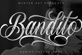
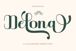
字体描述
Johann Michael Fleischmann was born June 15th, 1707 in Wöhrd near Nuremberg. After attending Latinschool he started an apprenticeship as punchcutter in the crafts enterprise of Konstantin Hartwig in Nuremberg, which ought to last six years. For his extraordinary talent Fleischmann completed his apprenticeship after four and a half years, which was very unusual. 1727 his years of travel (very common in these days) began, during which he perfected his handcraft by working in different enterprises as journeyman. First location was Frankfurt/Main where he worked for nearly a year at the renowned type foundery of Luther and Egenolff. Passing Mainz he continued to Holland, where he arrived in November 1728 and stayed till he died in 1768. In Amsterdam he worked for several type founderies, among others some weeks for Izaak van der Putte; in The Hague for Hermanus Uytwerf. Between 1729 and 1732 he created several exquisite alphabets for Uytwerf, which were published under his own name (after his move to Holland Fleischmann abandoned the second n in his name), apparently following the stream of the time. After the two years with Uytwerf, Fleischmann returned to Amsterdam, where he established his own buiseness as punchcutter; following an advice of the bookkeeper and printer from Basel Rudolf Wetstein he opened his own type foundery 1732, which he sold in 1735 to Wetstein for financial reasons. In the following Fleischmann created several types and matrices exclusively for Wetstein. In 1743 after the type foundery was sold by Wetstein’s son Hendrik Floris to the upcoming enterprise of Izaak and Johannes Enschedé, Fleischmann worked as independent punchcutter mostly for this house in Haarlem. Recognizing his exceptional skills soon Fleischmann was consigned to cutting the difficult small-sized font types. The corresponding titling alphabets were mostly done by Jaques-Francois Rosart, who also cut the main part of the ornaments and borders used in the font examples of Enschedé. Fleischmann created for Enschedé numerous fonts. The font example published 1768 by Enschedé contains 3 titling alphabets, 16 antiquacuts, 14 italic cuts, 13 textura- and 2 scriptcuts, 2 greek typesets (upper cases and ligatures), 1 arabic, 1 malayan and 7 armenian font systems, 5 sets of musicnotes and the poliphonian musicnotesystem by Fleischmann. In total he brought into being about 100 alphabets - the fruits of fourty years of creative work as a punchcutter. Fleischmann died May 27th, 1768 at the age of 61. For a long time he was thought one of the leading punchcutters in Europe. A tragedy, that his creating fell into the turning of baroque to classicism. The following generations could not take much pleasure in his imaginative fonts, which were more connected to the sensuous baroque than to the bare rationalism of the upcoming industrialisation. Unfortunately therefore his masterpieces did not survive the 19th century and person and work of Fleischmann sank into oblivion. The impressive re-interpretation of the Fleischmann Antiqua and the corresponding italics by Erhard Kaiser from Leipzig, which were done for the Dutch Type Library from 1993 to 1997, snatched Fleischmann away from being forgotten by history. Therefore we want to place strong emphasis on this beautiful font. Fleischman Gotisch The other fonts by Fleischmann are only known to a small circle of connoisseurs and enthusiasts. So far they are not available in adequat quality for modern systems. Same applies the "Fleischman Gotisch", which has been made available cross platform to modern typeset-systems as CFF Open Type font through the presented sample. The Fleischman Gotisch has been proved to be one of the fonts, on which Fleischmann spent a good deal of his best effort; this font simply was near to his heart. Between 1744 and 1762 he created 13 different sizes of this font. All follow the same principles of forms, but their richness of details has been adapted to the particular sizes. In later times the font was modified more or less sensitive by various type founderies; letters were added, changed to current taste or replaced by others; so that nowadays a unique and binding mastercopy of this font is missing. Likewise the name of the font underwent several changes. Fleischmann himself probably never named his font, as he did with none of his fonts. By Enschedé this textura was named Nederduits, later on Nederduitsch. When the font was offered by the german type foundery Flinsch in Frankfurt/Main, the more convenient name of Fleischmann-Gotisch was chosen. In his "Masterbook of the font" and his "Abstract about the Et-character" Jan Tschichold refered to it as "Duyts" again. To honour the genious of Johann Michael Fleischmann we decided to name the writing "Fleischmann Gotisch PT" (unhyphenated). Developing the digital Fleischman Gotisch I decided not to use one of the thirteen sizes as binding mastercopy, but corresponding to the typical ductus of the font to re-create an independent use of forms strongly based on Fleischmann´s language of forms. All ascenders and descenders were standardised. Some characters, identified as added later on, were eliminated (especially the round lower case-R and several versions of longs- respectively f-ligatures) and others were adjusted to the principles of Fleischmann. Where indicated the diverse characters were integrated as alternative. They can be selected in the corresponding menu. All for the correct german black letter necessary longs and other ligatures were generated. Through the according integration into the feature-code about 85% of all ligatures in the type can be generated automatically. Problematic combinations (Fl, Fk, Fh, ll, lh, lk, lb) were created as ligatures and are likewise constructed automatically. A historically interesting letter is the "round r", which was already designated by Fleischmann; it is used after preceding round letters. Likewise interesting is the inventive form of the &-character, which is mentioned by Tschichold in his corresponding abstract. Nevertheless despite all interpretation it was very important to me to maintain the utmost fidelity to the original. With this digital version of a phantastic texturfont of the late baroque I hope to contribute to a blossoming of interest for this genious master of his kind: Johann Michel Fleischmann. OpenType features: - Unicode (ISO 10646-2) - contains 520 glyphes - Basic Latin - Latin-1 Supplement - Latin Extended-A - Latin Extended-B - Central European Glyhps - Ornaments - Fractions - Standard ligatures - Discretionary ligatures - Historical ligatures - Kerning-Table
许可类型
字形展示
授权流程
线上全程自助授权
正版承诺
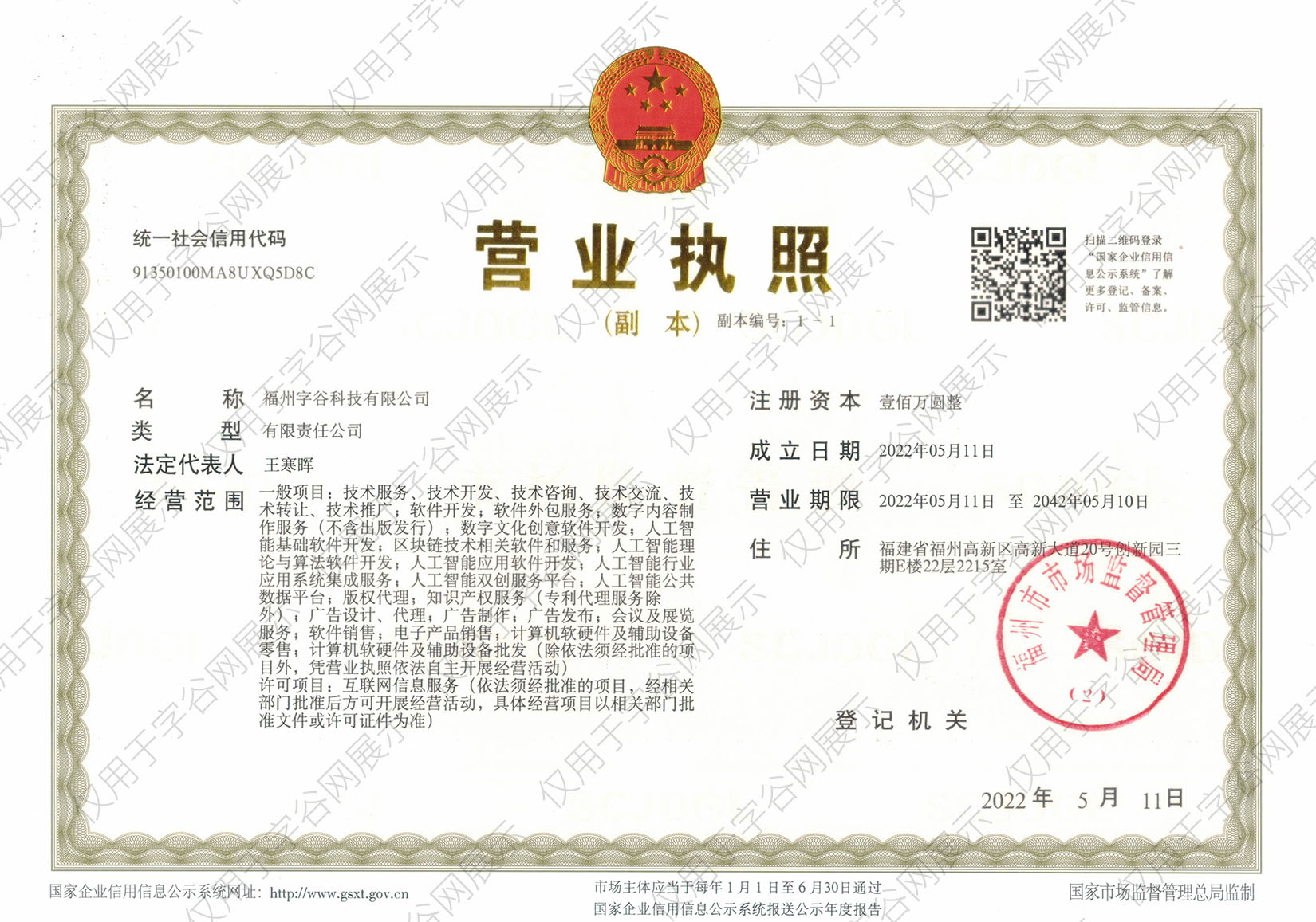
该字体由福州字谷科技有限公司代购
授权证明
官方出具授权证明,可在“个人中心-我的订单”查看或下载(付款后2个工作日内发货)
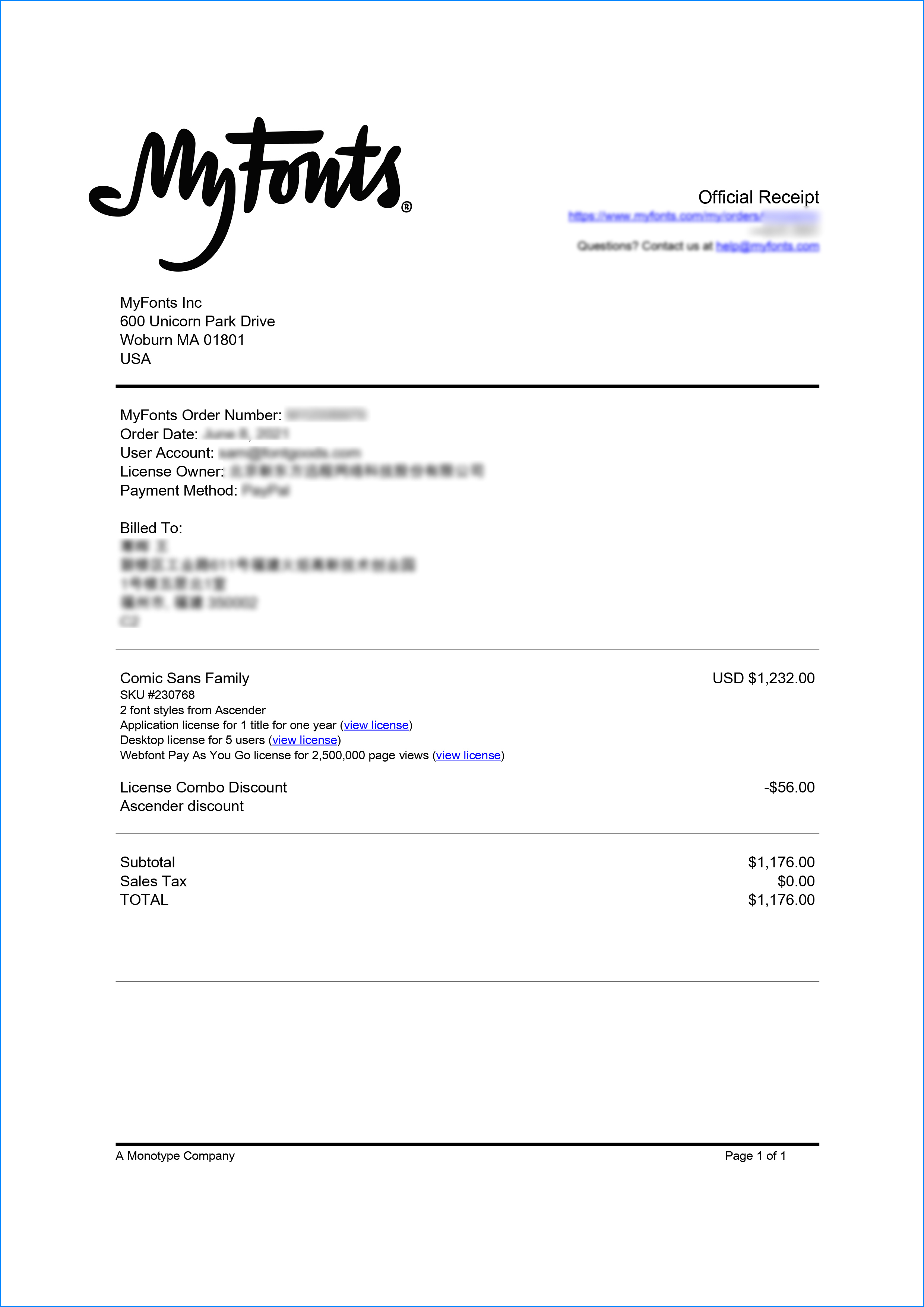
正规发票
每笔产生实际支付的订单都能在线申请开具增值税发票。
票
样
本

开票流程
1.在订单列表内点击“申请开票”
2.选择或新增您的“发票抬头”
3.提交申请
发票类型
1. 增值税普通发票,税率:1%
2. 增值税专用发票,税率:1%
发票内容:信息技术服务费
注:电子发票发送到您的电子邮箱,电子票据与纸质票据具有同等法律效力。
常见问题
1.代购商品已下架或暂时无价格怎么办
代购商品页面出现“代购方商品已下架”、“暂时无价格”、“正在更新价格”等提示,是因为远程服务器读取失败造成的,请您联系在线客服或微信客服18610955775获取详细报价。
2.海外字体常见的授权方式
桌面授权(Desktop)
“桌面”指的是计算机,桌面授权允许您将字体安装在计算机上,用于离线设计用途,包括设计Logo、海报、商品、杂志等,比如您在计算机上使用字体设计的静态图片是允许您随意传播的(不论线上、线下都可以使用);但不能将字体文件以任何形式嵌入您的作品,也就是说字体文件不能离开您的计算机,比如说将字体转换格式后嵌入网页或者在PPT中嵌入字体后进行传播都是不允许的;需要注意的是有些版权方可能会额外规定不允许将字体用于设计LOGO等指定用途,具体以版权方的规定为准。
该授权通常按用户数量进行授权,用户数指的是有可能安装该字体的电脑数量;桌面授权一般是永久有效的,如有指定年限我们的购买页面都会有所提示;授权有效期内设计的作品是可以永久使用的,但授权有效期外还需要继续使用字体进行设计的话需要重新购买授权。
网页授权(Webfont)
网页授权顾名思义就是允许将字体文件嵌入到各类网页中的一种授权方式,不论字体文件是否经过转换格式,也不论是完整嵌入或是部分嵌入,字体文件以任何形式嵌入网页都需要取得该授权。
不同版权方对于网页授权的售卖方式有所差别,除了按授权期限售卖之外,一般还会规定授权期限内的总浏览量或每月浏览量,您可以根据您的网站需求选择购买,购买授权后若遇浏览量超出预期的可重复购买。
应用授权(App)
应用授权允许您将字体文件嵌入到您开发或运营的APP中,不论是游戏APP、教育APP、音乐APP,任何APP只要嵌入了字体文件都需要取得该授权。
应用授权可按照授权期限、装机量、APP数量等多种形式售卖。
电子书授权(ePub)
电子书授权允许将字体文件嵌入到电子出版物中,但是运行电子出版物的操作系统中不能安装字体软件。
该授权可按照授权期限、书目数量、设备总量、浏览量等多种形式售卖。
服务器授权(Server)
服务器授权允许您将字体以无法被提取的方式安装在被授权的服务器上,但不能在任何其他计算机或处理单元上安装字体。
该授权可按照授权期限、CPU核心数、客户端数量等多种形式售卖。
数字广告授权(Digital Ads)
数字广告授权允许您访问、下载和使用Web字体工具包中提供的Web字体,以便创建数字广告,但是仅用于在输出设备上发布数字广告。
该授权可按照按照授权期限、发布数量、曝光数量等多种形式售卖。
3.代购订单的授权何时生效
您完成付款后,服务商会在第一时间为您采购相关授权,授权流程通常会在24小时内完成,采购完成后您可以在订单详情中查看授权凭证并下载字体文件或申请开具发票。
4.广告公司为客户设计作品由谁购买字体授权
通常字库软件使用许可的“被许可方”应为设计方案的最终使用方,因此设计方案的业主单位必须获得所使用字体的相关授权,此外有些授权方式(如桌面授权)规定了使用终端的数量,那么所有使用该字体进行设计或者修改方案的计算机均需要获得授权。
5.如何帮客户购买授权
您提交订单时可以选择或者新增“被许可方”信息,在“被许可方”的表单内填写您的客户信息即可。
6.怎么安装字体
Windows系统:直接将字体文件复制到C:\Windows\Fonts,或者鼠标右键单击字体文件,选择“安装”即可;Mac系统:双击字体文件-点击安装,或者打开“应用程序”-“字体册”,将字体拖进去即可。
7.字体安装后在PS等软件中找不到怎么办
由于操作系统或者软件版本的原因,如果您在软件中找不到安装的字体,建议您先重启系统,该字体在列表中显示的可能为中文或英文名称,请您认真查找,只要字体安装成功,字体列表里就一定存在该字体。
8.支付过程出现风险提示怎么办
使用微信、支付宝等第三方支付工具进行大额支付时,有可能触发风险提示,请根据以下方法进行操作,您也可以通过企业对公转账的方式支付大额订单;


 京公网安备11010802038756号