


 正版商用
正版商用
 官方授权
官方授权
 正规发票
2日(节假日顺延)
正规发票
2日(节假日顺延)

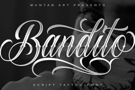
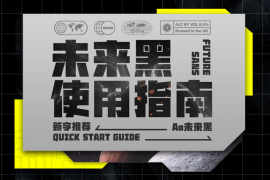
字体描述
The Generic Typeface Collection is a series of sans-serif typefaces inspired by the craftsmanship of graphic design, typesetting, and printing in the analogue era – before Adobe, Macintosh computers and desktop publishing – when dinosaurs ruled the earth. With the use of various typesetting apparatuses or dry transfer type, photo copiers, and shooting layouts and paste-ups to film, the printed results was not as exact, precise and predictable as it is today. When examining old prints, it is difficult not to like the way that characters in over- or underexposed film have a special type of vibe to them that is often sadly lost in today’s pursuit of total perfection.
Encouraged by this, I saw a need for a collection of typefaces that are non-clinical and non-conformist, and some that are coarse, rough and distorted – errors that might come from poor exposure when put on film, enlargements from small point texts, or maybe quality loss from successive generations of photocopies. Or all
of the above.
This is an attempt to incorporate spirit and personality into a set of typefaces without losing distinction. You might call it a homage to non-perfection. I call it human.
The Generic Typeface Collection consists of 11 fonts divided into four series. The three standard series – the Formal Release series, the Coarse Copy series, and the Rough Display series – all contain three fonts each. The Extra Splendor series contains a couple of shadow fonts for that little extra sparkle.
Formal Release – Handcrafted & Clean
The Formal Release series features sans-serif typefaces for everyday use. They are handcrafted and clean, human and uncomplicated. The Formal Release series contains three typefaces that add tons of personality to any text.
- G10 FR ‘Slim’ – a slightly under-exposed and clean typeface in a regular weight (228 glyphs - 1 alternate)
- G20 FR ‘Classic’ – a properly exposed clean typeface in a bold weight (228 glyphs - 1 alternate)
- G30 FR ‘Bulky’ – a heavily over-exposed clean typeface in an ultra weight (228 glyphs - 1 alternate)
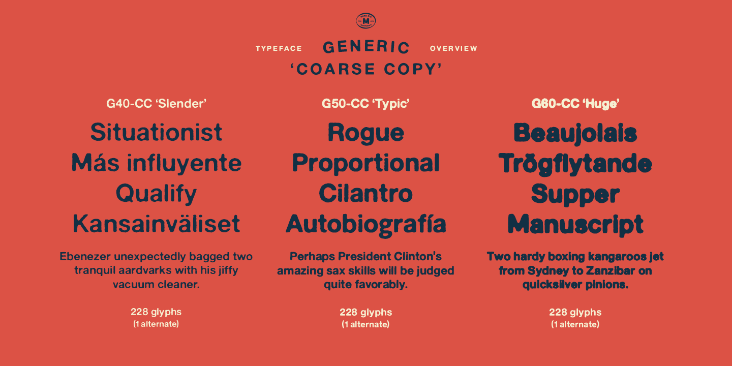
Coarse Copy – Dirty & Rough
The Coarse Copy series features non-conformist typefaces that are worn and rough, maybe after going through that bad copier a few times too much. The Coarse Copy series contains three sans-serif typefaces that add tons of spirit to any text without compromising too much on legibility. Try them on in poster-sizes and everyone will know that you mean business.
- G40 CC ‘Slender’ – an under-exposed coarse typeface in a regular weight (228 glyphs - 1 alternate)
- G50 CC ‘Typic’ – a properly exposed coarse typeface in a bold weight (228 glyphs - 1 alternate)
- G60 CC ‘Huge’ – a heavily over-exposed coarse typeface in an ultra weight (228 glyphs - 1 alternate)
Rough Display – Faded & Decorative
The Rough Display series features attention-seeking decorative typefaces in three feature-packed fonts. Faded and gritty like the image distortion and degradation from successive generations of photocopies, they are eye-catching typefaces intended to stand out in bigger point sizes. Use these typefaces for signage, headlines and similar situations were a strong typographic statement is desired. We have packed no less than 1,334 alternate characters and 212 discretionary ligatures into this series for a greater chance of not having characters that look exactly the same more than once.
- G70 RD ‘Slinky’ – an under-exposed rough and decorative typeface in a regular weight (741 glyphs – 448 alternates – 66 discretionary ligatures)
- G80 RD ‘Standard’ – a properly-exposed rough and decorative typeface in a bold weight (748 glyphs – 448 alternates – 73 discretionary ligatures)
- G90 RD ‘Swollen’ – a heavily over-exposed rough and decorative typeface in an ultra weight (748 glyphs – 448 alternates – 73 discretionary ligatures)
Extra Splendor – Sparkling & Extraordinary
The Extra Splendor series features two shadow typefaces for that little extra sparkle. One clean shadow to be used with G20 FR ‘Classic’, and one rough shadow to be used with G80 RD ‘Standard’. Having the shadows separate from the main typeface adds another layer of expressiveness in that you can try out color combinations for that extra splendor.
Tips for matching (applies to both the base font and the shadow font): Set the kerning to Metric, not optical. Increase tracking to accommodate for the shadows extra width.
- G25 ES ‘Classic Shadow’ – a clean shadow to be used with G20 FR ‘Classic’ (228 glyphs – 1 alternate)
- G85 ES ‘Standard Shadow’ – a rough shadow to be used with 80 RD ‘Standard’ (227 glyphs)
OpenType features – alternate characters and discretionary ligatures – can be accessed by using OpenType friendly professional design applications, such as Adobe Illustrator, Adobe InDesign, and Adobe Photoshop.
许可类型
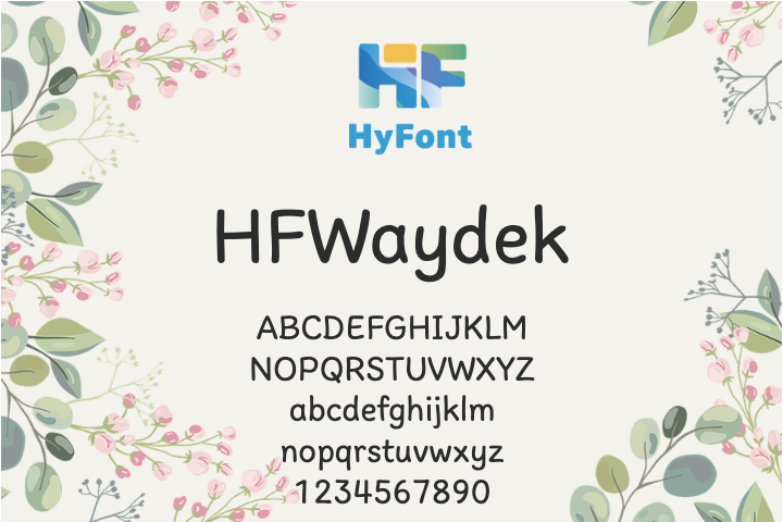
字形展示
授权流程
线上全程自助授权
正版承诺
该字体由福州字谷科技有限公司代购

授权证明
官方出具授权证明,可在“个人中心-我的订单”查看或下载(付款后2个工作日内发货)
正规发票
每笔产生实际支付的订单都能在线申请开具增值税发票。
票
样
本

开票流程
1.在订单列表内点击“申请开票”
2.选择或新增您的“发票抬头”
3.提交申请
发票类型
1. 电子增值税普通发票,税率:1%
2. 电子增值税专用发票,税率:1%
发票内容:信息技术服务费
注:电子发票发送到您的电子邮箱,电子票据与纸质票据具有同等法律效力。
常见问题
1.代购商品已下架或暂时无价格怎么办
代购商品页面出现“代购方商品已下架”、“暂时无价格”、“正在更新价格”等提示,是因为远程服务器读取失败造成的,请您联系在线客服或微信客服18610955775获取详细报价。
2.海外字体常见的授权方式
桌面授权(Desktop)
“桌面”指的是计算机,桌面授权允许您将字体安装在计算机上,用于离线设计用途,包括设计Logo、海报、商品、杂志等,比如您在计算机上使用字体设计的静态图片是允许您随意传播的(不论线上、线下都可以使用);但不能将字体文件以任何形式嵌入您的作品,也就是说字体文件不能离开您的计算机,比如说将字体转换格式后嵌入网页或者在PPT中嵌入字体后进行传播都是不允许的;需要注意的是有些版权方可能会额外规定不允许将字体用于设计LOGO等指定用途,具体以版权方的规定为准。
该授权通常按用户数量进行授权,用户数指的是有可能安装该字体的电脑数量;桌面授权一般是永久有效的,如有指定年限我们的购买页面都会有所提示;授权有效期内设计的作品是可以永久使用的,但授权有效期外还需要继续使用字体进行设计的话需要重新购买授权。
网页授权(Webfont)
网页授权顾名思义就是允许将字体文件嵌入到各类网页中的一种授权方式,不论字体文件是否经过转换格式,也不论是完整嵌入或是部分嵌入,字体文件以任何形式嵌入网页都需要取得该授权。
不同版权方对于网页授权的售卖方式有所差别,除了按授权期限售卖之外,一般还会规定授权期限内的总浏览量或每月浏览量,您可以根据您的网站需求选择购买,购买授权后若遇浏览量超出预期的可重复购买。
应用授权(App)
应用授权允许您将字体文件嵌入到您开发或运营的APP中,不论是游戏APP、教育APP、音乐APP,任何APP只要嵌入了字体文件都需要取得该授权。
应用授权可按照授权期限、装机量、APP数量等多种形式售卖。
电子书授权(ePub)
电子书授权允许将字体文件嵌入到电子出版物中,但是运行电子出版物的操作系统中不能安装字体软件。
该授权可按照授权期限、书目数量、设备总量、浏览量等多种形式售卖。
服务器授权(Server)
服务器授权允许您将字体以无法被提取的方式安装在被授权的服务器上,但不能在任何其他计算机或处理单元上安装字体。
该授权可按照授权期限、CPU核心数、客户端数量等多种形式售卖。
数字广告授权(Digital Ads)
数字广告授权允许您访问、下载和使用Web字体工具包中提供的Web字体,以便创建数字广告,但是仅用于在输出设备上发布数字广告。
该授权可按照按照授权期限、发布数量、曝光数量等多种形式售卖。
3.代购订单的授权何时生效
您完成付款后,服务商会在第一时间为您采购相关授权,授权流程通常会在24小时内完成,采购完成后您可以在订单详情中查看授权凭证并下载字体文件或申请开具发票。
4.广告公司为客户设计作品由谁购买字体授权
通常字库软件使用许可的“被许可方”应为设计方案的最终使用方,因此设计方案的业主单位必须获得所使用字体的相关授权,此外有些授权方式(如桌面授权)规定了使用终端的数量,那么所有使用该字体进行设计或者修改方案的计算机均需要获得授权。
5.如何帮客户购买授权
您提交订单时可以选择或者新增“被许可方”信息,在“被许可方”的表单内填写您的客户信息即可。
6.怎么安装字体
Windows系统:直接将字体文件复制到C:\Windows\Fonts,或者鼠标右键单击字体文件,选择“安装”即可;Mac系统:双击字体文件-点击安装,或者打开“应用程序”-“字体册”,将字体拖进去即可。
7.字体安装后在PS等软件中找不到怎么办
由于操作系统或者软件版本的原因,如果您在软件中找不到安装的字体,建议您先重启系统,该字体在列表中显示的可能为中文或英文名称,请您认真查找,只要字体安装成功,字体列表里就一定存在该字体。
8.支付过程出现风险提示怎么办
使用微信、支付宝等第三方支付工具进行大额支付时,有可能触发风险提示,请根据以下方法进行操作,您也可以通过企业对公转账的方式支付大额订单;


- food
- rough
- heavy
- logo
- letterpress
- punk
- coarse
- alternates
- vintage
- banner
- copy
- beverage
- texture
- printing
- human
- distorted
- craft
- outdoors
- handcrafted
- display
- faded
- regular
- dirty
- beer
- decorative
- poster
- packaging
- menu
- gritty
- ultra
- worn
- personality
- signage
- headline
- retro
- indie
- shadow
- display font
- handmade
- music
- ligatures
- book
- typesetting
- shaded
- grit
- more
- analogue
- old-school
- combo
- wordmark
- photocopy
- non-conformist
- craft beer
- heading
- casual
- legible
- clean
- playful
- rounded
- comic


 京公网安备11010802038756号