


 正版商用
正版商用
 官方授权
官方授权
 正规发票
3个工作日
正规发票
3个工作日 
字体描述
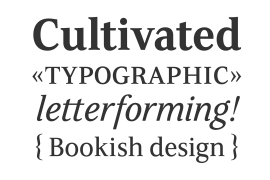
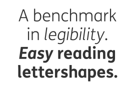
Avenir Next Pro is a new take on a classic face—it’s the result of a project whose goal was to take a beautifully designed sans and update it so that its technical standards surpass the status quo, leaving us with a truly superior sans family.
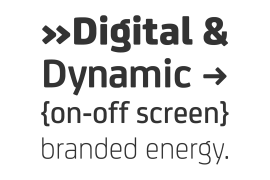
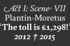
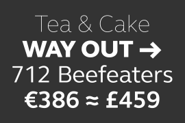
This family is not only an update though, in fact it is the expansion of the original concept that takes the Avenir Next design to the next level. In addition to the standard styles ranging from UltraLight to Heavy, this 32-font collection offers condensed faces that rival any other sans on the market in on and off—screen readability at any size alongside heavy weights that would make excellent display faces in their own right and have the ability to pair well with so many contemporary serif body types. Overall, the family’s design is clean, straightforward and works brilliantly for blocks of copy and headlines alike.
Akira Kobayashi worked alongside Avenir’s esteemed creator Adrian Frutiger to bring Avenir Next Pro to life. It was Akira’s ability to bring his own finesse and ideas for expansion into the project while remaining true to Frutiger’s original intent, that makes this not just a modern typeface, but one ahead of its time.
Complete your designs with these perfect pairings: Dante™, Joanna® Nova, Kairos™, Menhart™, Soho® and ITC New Veljovic®.
Avenir Next Variables are font files which are featuring two axis, weight and width. They have a preset instance from UltraLight to Heavy and Condensed to Roman width.
The preset instances are: Condensed UltraLight, Condensed UltraLight Italic, Condensed Thin, Condensed Thin Italic, Condensed Light, Condensed Light Italic, Condensed, Condensed Italic, Condensed Demi, Condensed Demi Italic, Condensed Medium, Condensed Medium Italic, Condensed Bold, Condensed Bold Italic, Condensed Heavy, Condensed Heavy Italic, UltraLight, UltraLight Italic, Thin, Thin Italic, Light, Light Italic, Regular, Italic, Demi, Demi Italic, Medium, Medium Italic, Bold, Bold Italic, Heavy, Heavy Italic.
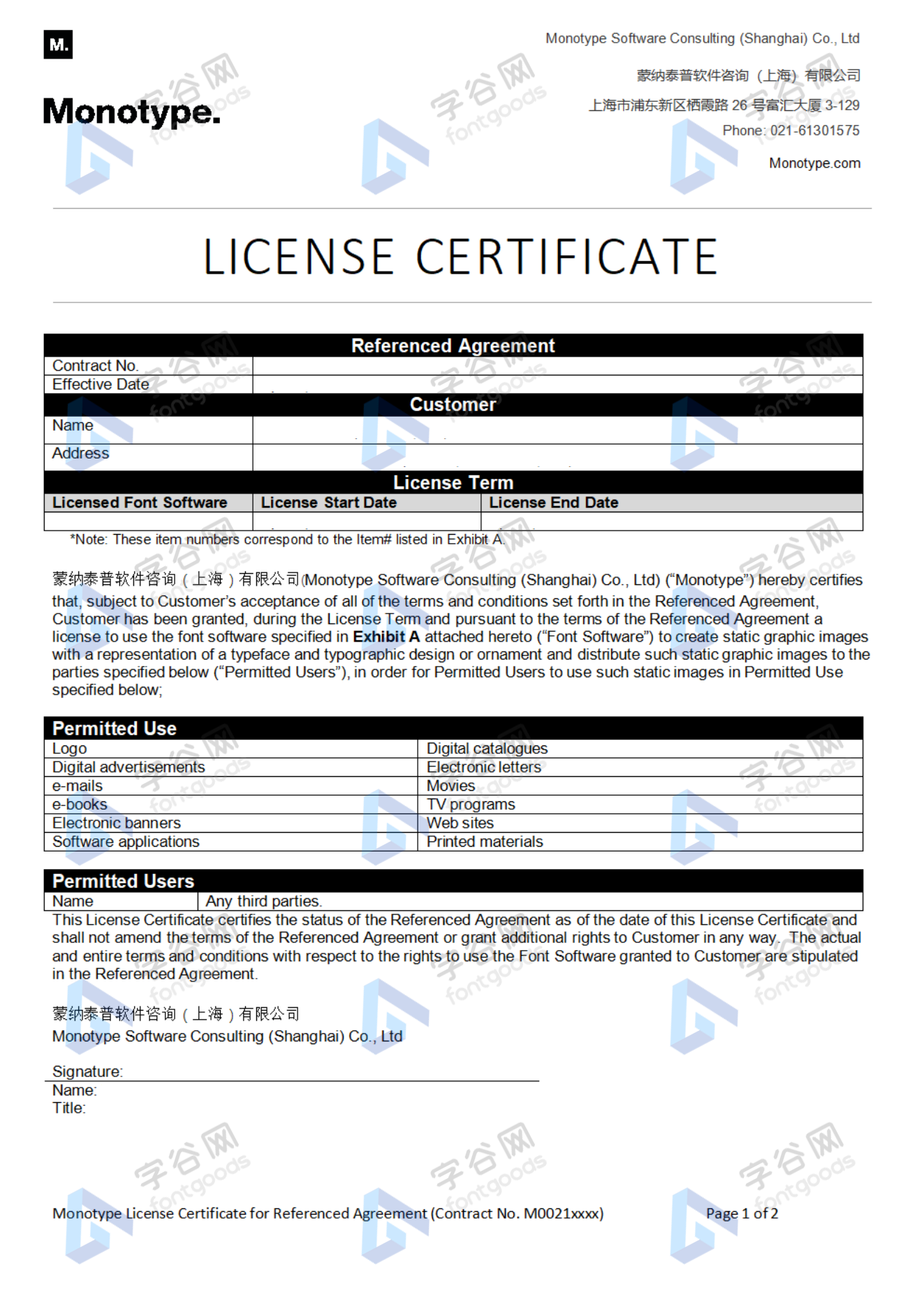
许可类型
|
许可名称
|
许可描述
|
许可协议原文(英文)
|
|
|---|---|---|---|
|
桌面
|
在Windows或macOS安装字体,在桌面应用程序使用字体(包括:Photoshop、Illustrator、CorelDRAW、Word等),创建和打印文档以及静态图像。多数情况下,可在徽标/商标、产品包装、宣传物料、新媒体、网站、应用程序当中使用这些图像。
|
授权流程
线下授权
官方授权
本店所有字体均由Monotype官方授权字谷网代理销售
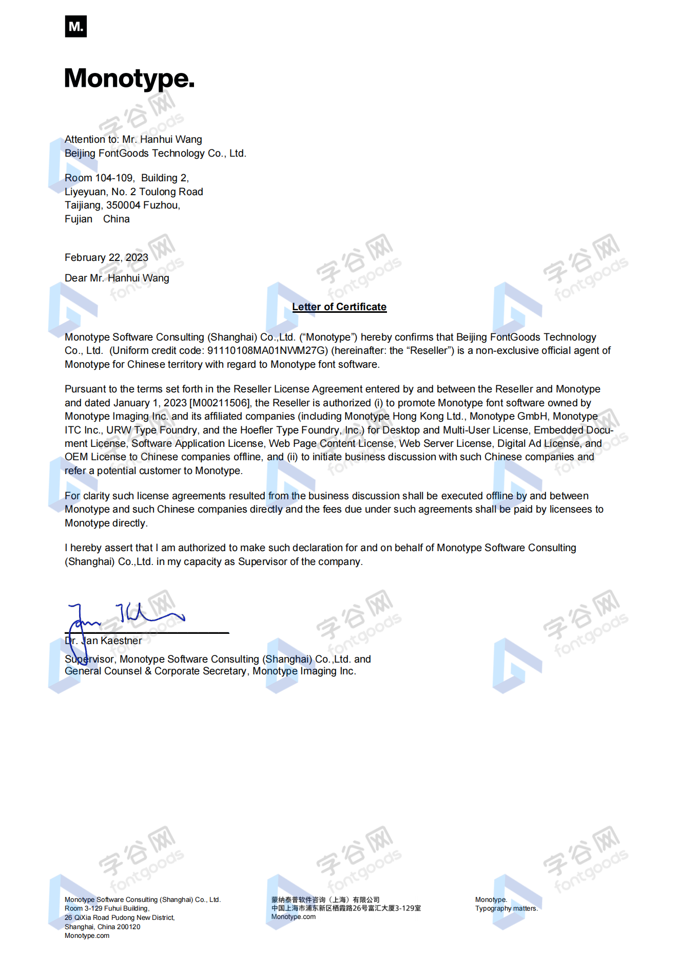
授权证明
Monotype官方出具授权证明
正规发票
每笔产生实际支付的订单都能在线申请开具增值税发票。
票
样
本

开票流程
1.在订单列表内点击“申请开票”
2.选择或新增您的“发票抬头”
3.提交申请
发票类型
1. 增值税普通发票,税率:6%
2. 增值税专用发票,税率:6%
发票内容:信息技术服务费
注:电子发票发送到您的电子邮箱,电子票据与纸质票据具有同等法律效力。
常见问题
1.广告公司为客户设计作品由谁购买字体授权
通常字库软件使用许可的“被许可方”应为设计方案的最终使用方,因此设计方案的业主单位必须获得所使用字体的相关授权,此外有些授权方式(如桌面授权)规定了使用终端的数量,那么所有使用该字体进行设计或者修改方案的计算机均需要获得授权。
2.如何帮客户购买授权
您提交订单时可以选择或者新增“被许可方”信息,在“被许可方”的表单内填写您的客户信息即可。
3.怎么安装字体
Windows系统:直接将字体文件复制到C:\Windows\Fonts,或者鼠标右键单击字体文件,选择“安装”即可;Mac系统:双击字体文件-点击安装,或者打开“应用程序”-“字体册”,将字体拖进去即可。
4.字体安装后在PS等软件中找不到怎么办
由于操作系统或者软件版本的原因,如果您在软件中找不到安装的字体,建议您先重启系统,该字体在列表中显示的可能为中文或英文名称,请您认真查找,只要字体安装成功,字体列表里就一定存在该字体。
5.支付过程出现风险提示怎么办
使用微信、支付宝等第三方支付工具进行大额支付时,有可能触发风险提示,请根据以下方法进行操作,您也可以通过企业对公转账的方式支付大额订单;


- display
- geometric
- business card
- legible
- legibility
- favourite
- ui
- сѓр¶рµ рµсѓс‚сњ
- 50a
- user interface
- ux
- general use
- vr/ar
- ar/vr
- virtual reality
- augmented reality
- heading
- casual
- clean
- ñƒð¶ðµ ðµññ‚ñœ
- sans serif
- test
- уже есть
- Anno 1920
- Encyclopaedia
- Luxurious
- Std
- 19th Century
- Optical Size
- Clarity
- Humanistic Sans
- Charming
- Bengali
- 80s
- Dictionaries
- Professional
- Architectural
- Healine
- Original
- Platinum Collection
- Hangul
- Athletic
- Classic
- Large
- Subscript
- Business
- Screen
- Anno 2000
- Headline
- Stern
- Male
- Encyclopedia
- Announcements
- Pro
- Clear
- Old English
- Manuals
- Bilingual
- Tazugane
- Micro
- Poster
- Screens
- Moderate
- Geometric Sans
- Swiss
- Kana
- Office
- Technical
- Hand-Hinted
- INSP-Heritage
- Warm
- Menus
- 21st Century
- Sans-Serif
- Platinum
- University
- Propaganda
- Tazugane Info
- Chinese
- Jugendstil
- Football
- Minimal
- Condensed
- Decorative
- Film Titling
- Art Nouveau
- Distressed
- Brands
- Friendly
- Chinese Freestyle
- Arabian
- Light
- Ce
- Crafted
- 1978-1982
- Branding
- Brand
- Victorian
- Rounded
- Vintage
- Magazine
- Sports
- Frutiger
- Minimalist
- Readability
- Neutral
- Sans
- Lexica
- Dynamic
- Ot
- Emblem
- Superscript
- Gothic
- Calm
- Packaging
- Dictionary
- Information
- Mid-Century
- Urdu
- Opentype
- Fun
- Grecian
- Bauhaus
- Simplified Chinese
- Rock'N'Roll
- Grotesk
- Constructed
- Confident
- Square
- Arabic
- 1930s
- Humanist
- Catalogs
- Farsi
- Simplified
- Gotham Alternative
- Indic
- Digitally
- Authoritative
- Contemporary
- Square Sans
- Formal
- Monoline
- Traditional
- Eu-Fonts
- Cyrillic
- Advertisment
- Simple
- Octagonal
- Korean
- Univers
- Stout
- Hand-Painted
- Sleek
- Greek
- 1920s
- 19thcentury
- On Screen
- Gb2312
- Variable
- Modernism
- Elegant
- Provocative
- Triangle
- Precise
- Simplicity
- Frutiger Chinese
- Small
- Young Urban
- 20s
- Mandarin
- Detailed
- Admire
- Grotesque
- 1980s
- Expressive
- Compressed
- Invitation
- Heavy
- Industrial
- Greek-Opentype
- International
- Automotive
- Sport
- Readable
- Modern
- Anno 1980
- Hand Tuned
- Varsity
- Sharp
- Newspaper
- Brave
- Cyrillic -Opentype
- Paul Renner
- Stencil
- Headlines
- 1950s
- Advertising
- Speedy
- Neue Frutiger Chinese
- Unexpected
- Rock And Roll
- INSP-Type on Screen
- INSP-Interbrand
- Text
- Traditional Chinese
- Newsletters
- Book
- Linotype
- Energetic
- Paneuropean
- Japanese
- Documents
- Com
- Radiate
- Business Cards
- Central European
- Honest
- Corporate
- Clean Cut
- W1g
- Human
- Pan-European
- Signage
- badge_Best-Seller_13


 京公网安备11010802038756号