


 正版商用
正版商用
 官方授权
官方授权
 正规发票
2日(节假日顺延)
正规发票
2日(节假日顺延)

字体描述
TT Marxiana useful links:
Specimen | History of creation | Graphic presentation | Customization options
Please note! If you need OTF versions of the fonts, just email us at commercial@typetype.org
About TT Marxiana: TT Marxiana is a project to reconstruct a set of pre-revolutionary fonts that were used in the layout of the "Niva" magazine, published by the St. Petersburg publishing house A.F. Marx. In our project, we decided to focus on a specific set of fonts that were used in the preparation and printing of the "Niva" magazine in 1887, namely its Antiqua and Italic, Grotesque and Elzevir.
As part of the TT Marxiana project, we sought to adhere to strict historicity and maintain maximum proximity to the paper source. We tried to avoid any “modernization” of fonts, unless of course we consider this to be kerning work, the introduction of OpenType features and creation of manual hinting. As a result, with the TT Marxiana font family, a modern designer gets a full-fledged and functional set of different fonts, which allows using modern methods and using modern software to create, for example, a magazine in a design typical of the late 19th century.
The TT Marxiana project started in the late summer of 2018 and from the very beginning went beyond the traditional projects of TypeType because of the importance of preserving the historical identity. Since up to this point, we had never before reconstructed the font from historical paper sources and with such a level of elaboration and attention to detail, it took us two years to implement this project. You can read more about all stages of the project in our blog, and here we will briefly talk about the result.
As it turned out, drawing a font following the scanned pages of a century-old magazine is a very difficult task. In fact, such a font reconstruction very much resembles archaeological excavations or solving a complex cipher, and all these efforts are needed only in order to finally understand what steps need to be taken so that the resulting font is not just an antiqua, but the specific and accurate antiqua from "Niva" magazine.
In addition, due to the specifics of printing, same characters in the old magazine setting looked completely different, which greatly complicated the task. In one place, there was less ink than needed, and the letter in the reference was not well-printed and thin, in some other place there was more ink and the letter had flooded. An important task was to preserve and convey this feeling of typographic printing, but at the same time it was important to identify the common logic and character of the dot gains so that the font would form a harmonious, single, but at the same time lively picture.
Since the "Niva" magazine was historically published in Russian, the magazine had no shortage of references for the reconstruction of Cyrillic characters, but there were not many Latin letters in the magazine at all. In addition, the paper source lacked a part of punctuation, diacritics, there were no currency signs nor ligatures at all—we developed all these characters based on font catalogs of the 19–20 centuries, trying to reflect characteristic details from the main character composition to the max. So, for example, the Germandbls character, which is not in the original "Niva" set, we first found in one of the font catalogs, but still significantly redesigned it.
We decided that in such a voluminous project, only graphic similarities with the original source are not enough and we came up with a feature that can be used to exchange modern Russian spelling for pre-revolutionary spelling. When this feature is turned on, yat and yer appear in the necessary places (i, ѣ, b, ѳ and ѵ), the endings of the words change, and so appears a complete sensation of the historical text. This feature works in all fonts of the TT Marxiana font family.
TT Marxiana Antiqua is a scotch style serif, the drawing of which carefully preserved some of the artifacts obtained by printing, namely dot gain, a slight deformation of the letters and other visual nuances. TT Marxiana Antiqua has an interesting stylistic set that imitates the old setting and in which some of the signs are made with deliberate sticking or roughness. Using this set will provide an opportunity to further simulate the setting of that great time.
TT Marxiana Grotesque is a rather thick and bold old grotesk. Its drawing also maximally preserved the defects obtained during printing and characteristic of its paper reference. In addition to pre-revolutionary spelling, TT Marxiana Grotesque has a decorative set with an inversion. This is a set of uppercase characters, numbers and punctuation, which allows you to type inverse headers, i.e. print white on black. As a result of using this set, you get the text against black bars—this way of displaying was very characteristic for print advertising at the turn of the century. In addition, about 30 decorative indicator stubs were drawn for this set: arrows, hands, clubs, etc.
TT Marxiana Elzevir is a title or header font and is a compilation of monastic Elzevir that were actively used in the "Niva" magazine for all its prints. Unlike the antiqua, TT Marxiana Elzevir has sharper forms, and the influence of deformations from typographic printing is not as noticeable in the forms of its signs. This is primarily due to the specifics of its drawing and the fact that it was usually used as a heading font and was printed in large sizes. The height of the lowercase and uppercase characters of Elsevier is the same as the heights of the antiqua, but the font is more contrasting and lighter, it has a lot of white and, unlike the antiqua and the grotesque, there are a lot of sharp corners. An exclusive feature of the TT Marxiana Elzevir is an alternative set of uppercase characters with swash.
• TT Marxiana Antiqua consist of 625 glyphs each and and it has 23 OpenType features, such as: aalt, ccmp, locl, subs, sinf, sups, numr, dnom, frac, ordn, lnum, pnum, tnum, onum, salt, calt, liga, ss01, ss02, ss03, ss04, ss05, case.
• TT Marxiana Antiqua Italic consist of 586 glyphs each and and it has 22 OpenType features, such as: aalt, ccmp, locl, subs, sinf, sups, numr, dnom, frac, ordn, lnum, pnum, tnum, onum, salt, calt, liga, ss01, ss02, ss03, ss04, case.
• TT Marxiana Grotesque consists of 708 glyphs and it has 22 OT features, such as: aalt, ccmp, locl, subs, sinf, sups, numr, dnom, frac, ordn, lnum, pnum, tnum, onum, salt, calt, liga, ss01, ss02, ss03, ss04, case.
• TT Marxiana Elzevir consists of 780 glyphs and it has 21 OT features, such as: aalt, ccmp, locl, ordn, frac, tnum, onum, lnum, pnum, calt, ss01, ss02, ss03, ss04, ss05, ss06, salt, c2sc, smcp, case, liga.
FOLLOW US:
Instagram | Facebook | Website
TT Marxiana language support: Acehnese, Afar, Albanian, Alsatian, Aragonese, Asu, Aymara, Banjar, Basque, Belarusian (cyr), Bemba, Bena, Betawi, Bislama, Boholano, Bosnian (cyr), Breton, Bulgarian (cyr), Catalan, Cebuano, Chamorro, Chiga, Cornish, Corsican, Cree, Danish, Dutch, Embu, English, Erzya, Estonian, Faroese, Fijian, Filipino, Finnish, French, Friulian, Gaelic, Galician, German, Gusii, Haitian Creole, Hiri Motu, Hungarian, Icelandic, Ilocano, Indonesian, Interlingua, Irish, Italian, Javanese, Judaeo-Spanish, Kabuverdianu, Kalenjin, Karachay-Balkar (cyr), Kashubian, Khasi, Khvarshi, Kinyarwanda, Kirundi, Kongo, Kumyk, Ladin, Leonese, Luganda, Luo, Luxembourgish, Luyia, Macedonian, Machame, Makhuwa-Meetto, Makonde, Malagasy, Malay, Manx, Mauritian Creole, Minangkabau, Montenegrin (cyr), Mordvin-moksha, Morisyen, Nauruan, Ndebele, Nias, Nogai, Norwegian, Nyankole, Occitan, Oromo, Palauan, Polish, Portuguese, Rheto-Romance, Rohingya, Romansh, Rombo, Rundi, Russian, Rusyn, Rwa, Samburu, Sango, Sangu, Scots, Sena, Serbian (cyr), Seychellois Creole, Shambala, Shona, Soga, Somali, Sotho, Spanish, Sundanese, Swahili, Swazi, Swedish, Swiss German, Tagalog, Taita, Tetum, Tok Pisin, Tsonga, Tswana, Ukrainian, Uyghur, Valencian, Volapük, Võro, Vunjo, Walloon, Xhosa, Zulu.
许可类型
字形展示
授权流程
线上全程自助授权
正版承诺
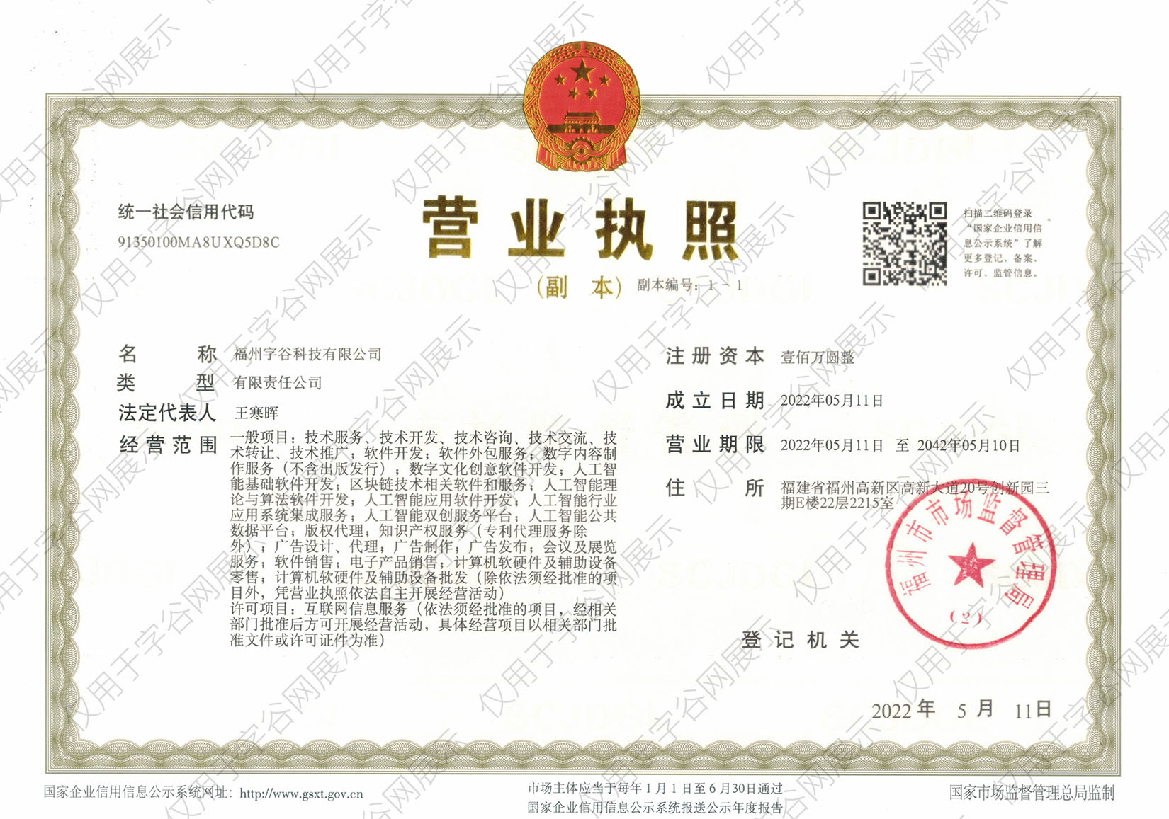
该字体由福州字谷科技有限公司代购
授权证明
官方出具授权证明,可在“个人中心-我的订单”查看或下载(付款后2个工作日内发货)
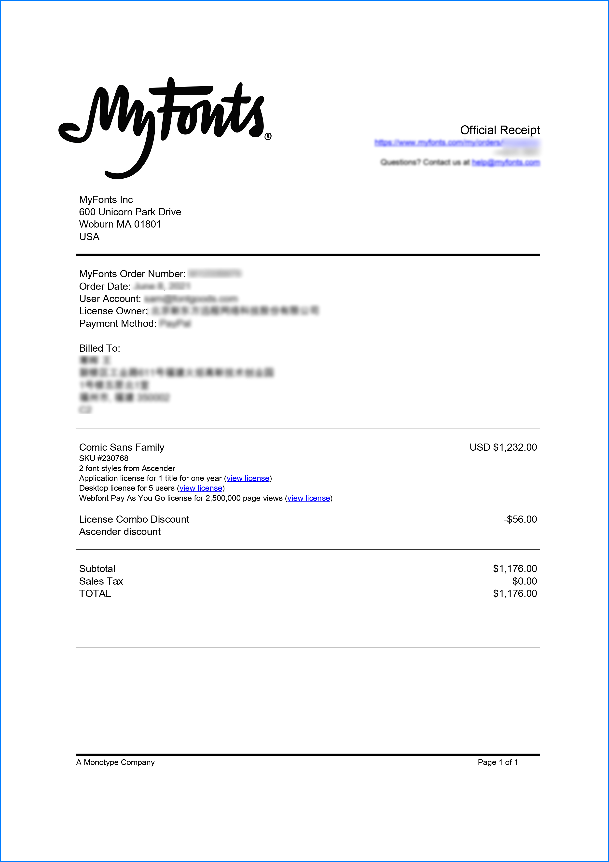
正规发票
每笔产生实际支付的订单都能在线申请开具增值税发票。
票
样
本

开票流程
1.在订单列表内点击“申请开票”
2.选择或新增您的“发票抬头”
3.提交申请
发票类型
1. 电子增值税普通发票,税率:1%
2. 电子增值税专用发票,税率:1%
发票内容:信息技术服务费
注:电子发票发送到您的电子邮箱,电子票据与纸质票据具有同等法律效力。
常见问题
1.代购商品已下架或暂时无价格怎么办
代购商品页面出现“代购方商品已下架”、“暂时无价格”、“正在更新价格”等提示,是因为远程服务器读取失败造成的,请您联系在线客服或微信客服18610955775获取详细报价。
2.海外字体常见的授权方式
桌面授权(Desktop)
“桌面”指的是计算机,桌面授权允许您将字体安装在计算机上,用于离线设计用途,包括设计Logo、海报、商品、杂志等,比如您在计算机上使用字体设计的静态图片是允许您随意传播的(不论线上、线下都可以使用);但不能将字体文件以任何形式嵌入您的作品,也就是说字体文件不能离开您的计算机,比如说将字体转换格式后嵌入网页或者在PPT中嵌入字体后进行传播都是不允许的;需要注意的是有些版权方可能会额外规定不允许将字体用于设计LOGO等指定用途,具体以版权方的规定为准。
该授权通常按用户数量进行授权,用户数指的是有可能安装该字体的电脑数量;桌面授权一般是永久有效的,如有指定年限我们的购买页面都会有所提示;授权有效期内设计的作品是可以永久使用的,但授权有效期外还需要继续使用字体进行设计的话需要重新购买授权。
网页授权(Webfont)
网页授权顾名思义就是允许将字体文件嵌入到各类网页中的一种授权方式,不论字体文件是否经过转换格式,也不论是完整嵌入或是部分嵌入,字体文件以任何形式嵌入网页都需要取得该授权。
不同版权方对于网页授权的售卖方式有所差别,除了按授权期限售卖之外,一般还会规定授权期限内的总浏览量或每月浏览量,您可以根据您的网站需求选择购买,购买授权后若遇浏览量超出预期的可重复购买。
应用授权(App)
应用授权允许您将字体文件嵌入到您开发或运营的APP中,不论是游戏APP、教育APP、音乐APP,任何APP只要嵌入了字体文件都需要取得该授权。
应用授权可按照授权期限、装机量、APP数量等多种形式售卖。
电子书授权(ePub)
电子书授权允许将字体文件嵌入到电子出版物中,但是运行电子出版物的操作系统中不能安装字体软件。
该授权可按照授权期限、书目数量、设备总量、浏览量等多种形式售卖。
服务器授权(Server)
服务器授权允许您将字体以无法被提取的方式安装在被授权的服务器上,但不能在任何其他计算机或处理单元上安装字体。
该授权可按照授权期限、CPU核心数、客户端数量等多种形式售卖。
数字广告授权(Digital Ads)
数字广告授权允许您访问、下载和使用Web字体工具包中提供的Web字体,以便创建数字广告,但是仅用于在输出设备上发布数字广告。
该授权可按照按照授权期限、发布数量、曝光数量等多种形式售卖。
3.代购订单的授权何时生效
您完成付款后,服务商会在第一时间为您采购相关授权,授权流程通常会在24小时内完成,采购完成后您可以在订单详情中查看授权凭证并下载字体文件或申请开具发票。
4.广告公司为客户设计作品由谁购买字体授权
通常字库软件使用许可的“被许可方”应为设计方案的最终使用方,因此设计方案的业主单位必须获得所使用字体的相关授权,此外有些授权方式(如桌面授权)规定了使用终端的数量,那么所有使用该字体进行设计或者修改方案的计算机均需要获得授权。
5.如何帮客户购买授权
您提交订单时可以选择或者新增“被许可方”信息,在“被许可方”的表单内填写您的客户信息即可。
6.怎么安装字体
Windows系统:直接将字体文件复制到C:\Windows\Fonts,或者鼠标右键单击字体文件,选择“安装”即可;Mac系统:双击字体文件-点击安装,或者打开“应用程序”-“字体册”,将字体拖进去即可。
7.字体安装后在PS等软件中找不到怎么办
由于操作系统或者软件版本的原因,如果您在软件中找不到安装的字体,建议您先重启系统,该字体在列表中显示的可能为中文或英文名称,请您认真查找,只要字体安装成功,字体列表里就一定存在该字体。
8.支付过程出现风险提示怎么办
使用微信、支付宝等第三方支付工具进行大额支付时,有可能触发风险提示,请根据以下方法进行操作,您也可以通过企业对公转账的方式支付大额订单;


- decorative
- grotesk
- legible
- magazine
- lively
- revival
- alternates
- ligatures
- swashes
- monastic
- headlines
- sophisticated
- publishing
- museum
- antiqua
- display
- classic
- arrows
- hands
- web
- serif text
- old style
- cyrillic
- identity
- fashion
- logotype
- elzevir
- 20th century
- distinctive
- old style numerals
- 19th century
- body text
- packaging design
- true italic
- multilingual
- smallв caps
- editorial font
- headline font
- text font
- publishing font
- newspaper font
- packaging font
- old style figures
- truetype hinted
- title font
- cyr
- opentype features
- invitations
- titles and text
- small text
- рісђрѕс‚рµсѓрє
- headers
- text family
- webfont
- text and display
- magazine font
- poster font
- poster design
- hinting
- revival serif
- multilanguage
- рєрёсђрёр»р»рёс†р°
- multiple languages
- book design
- web fontп»ї
- р°рѕс‚рёрєрір°
- рєрёсђрёр»р»рёс‡рµсѓрєрёр№
- branding font
- cyrillic font
- russian font
- inversion
- marx
- niva
- niva magazine
- reconstruction
- 1887
- сќр»сњр·рёрірёсђ
- ttcommons65
- heading
- casual
- scotch roman
- elegant
- garalde
- Russian
- Serif
- Opentype
- True Italics
- Old
- Small Caps
- Small Capitals
- Editorial
- Titling
- Advertising
- Luxury
- Text
- Package
- Packaging
- Oldstyle Figures
- Poster
- Small Caps
- Calligraphic
- Branding
- Newsletter
- Newspaper
- Invitation
- Sans Serif
- Oldstyle
- Alternate
- News
- Headline
- Logo
- Title
- Revitalization
- Web Font'
- Grotesque
- Old-Style Numerals
- Smallcaps


 京公网安备11010802038756号