

 正版商用
正版商用
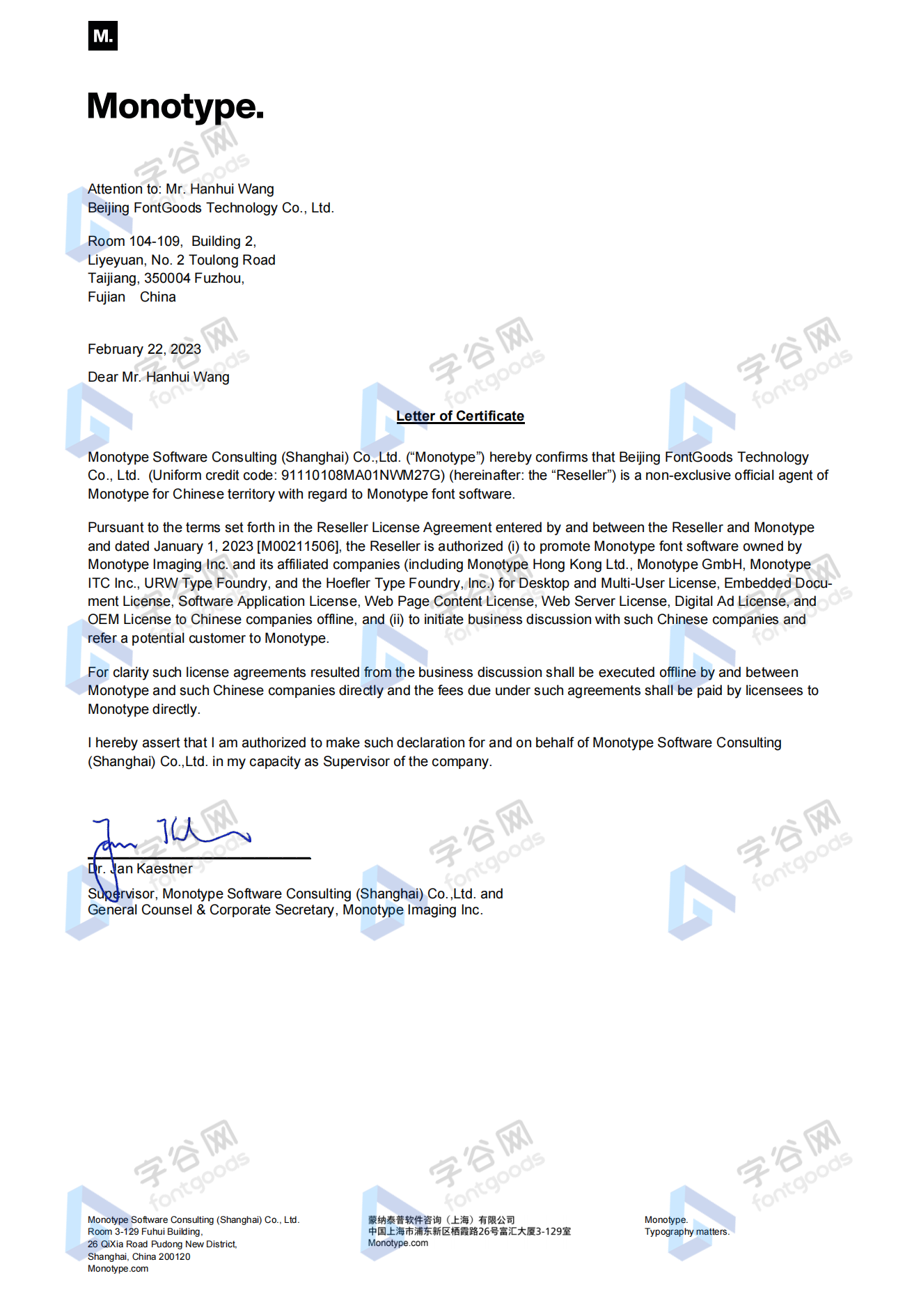
 官方授权
官方授权
 正规发票
3个工作日
正规发票
3个工作日 
字体描述
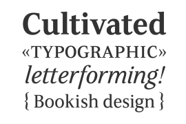
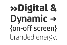
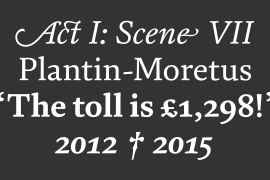
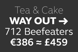
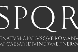
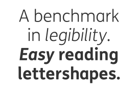
ITC Johnston is the result of the combined talents of Dave Farey and Richard Dawson, based on the work of Edward Johnston. In developing ITC Johnston, says London type designer Dave Farey, he did “lots of research on not only the face but the man.” Edward Johnston was something of an eccentric, “famous for sitting in a deck chair and carrying toast in his pockets.” (The deck chair was his preferred furniture in his own living room; the toast was so that he’d always have sustenance near at hand.) Johnston was also almost single-handedly responsible, early in this century, for the revival in Britain of the Renaissance calligraphic tradition of the chancery italic. His book Writing & Illuminating, & Lettering (with its peculiar extraneous comma in the title) is a classic on its subject, and his influence on his contemporaries was tremendous. He is perhaps best remembered, however, for the alphabet that he designed in 1916 for the London Underground Railway (now London Transport), which was based on his original “block letter” model.
Johnston’s letters were constructed very carefully, based on his study of historical writing techniques at the British Museum. His capital letters took their form from the best classical Roman inscriptions. “He had serious rules for his sans serif style,” says Farey, “particularly the height-to-weight ratio of 1:7 for the construction of line weight, and therefore horizontals and verticals were to be the same thickness. Johnston’s O’s and C’s and G’s and even his S’s were constructions of perfect circles. This was a bit of a problem as far as text sizes were concerned, or in reality sizes smaller than half an inch. It also precluded any other weight but medium ‘ any weight lighter or heavier than his 1:7 relationship.” Johnston was famously slow at any project he undertook, says Farey. “He did eventually, under protest, create a bolder weight, in capitals only ‘ which took twenty years to complete.”
Farey and his colleague Richard Dawson have based ITC Johnston on Edward Johnston’s original block letters, expanding them into a three-weight type family. Johnston himself never called his Underground lettering a typeface, according to Farey. It was an alphabet meant for signage and other display purposes, designed to be legible at a glance rather than readable in passages of text. Farey and Dawson’s adaptation retains the sparkling starkness of Johnston’s letters while combining comfortably into text.
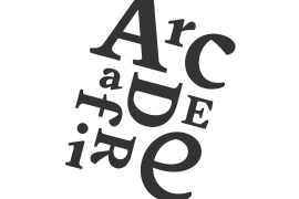
Johnston’s block letter bears an obvious resemblance to
Farey and Dawson, working from their studio in London’s Clerkenwell, wanted to create a type family that was neither a museum piece nor a bastardization, and that would “provide an alternative of the same school” to the omnipresent Gill Sans. “These alphabets,” says Farey, referring to the Johnston letters, “have never been developed as contemporary styles.” He and Dawson not only devised three weights of ITC Johnston but gave it a full set of small capitals in each weight ‘ something that neither the original Johnston face nor the Gill faces have ‘ as well as old-style figures and several alternate characters.
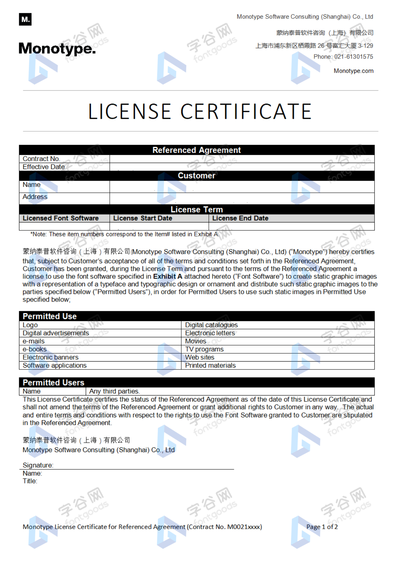
许可类型
|
用途
|
用途解释
|
桌面
|
|
|---|---|---|---|
|
商标设计
|
商标设计用字(包括:企业或产品的徽标、商标、注册商标等)
|
1个品牌/产品线
|
|
|
宣传语设计
|
宣传语设计用字(包括:企业或产品的标语、口号、广告语等)
|
1个品牌/产品线
|
|
|
VI设计
|
VI设计用字(包括:标准字、导视手册、企业手册等,不包括:商标设计、宣传语设计)
|
1个品牌/产品线
|
|
|
宣传册设计
|
宣传册设计用字(包括:宣传册、楼书、说明书等)
|
1个品牌/产品线
|
|
|
包装设计
|
实物包装设计用字(包括:食品、日用百货、办公文具、五金交电、电脑数码、光盘盘面等)
|
1个品牌/产品线
|
|
|
海报设计
|
海报设计用字(包括:易拉宝、背景板、海报喷绘、促销单页等)
|
1个品牌/产品线
|
|
|
办公设计
|
办公文档设计用字(包括:PPT、工作汇报、商业提案、策划案等,不包括:电子出版物嵌入)
|
1个品牌/产品线
|
|
|
应用程序设计
|
应用程序设计用字(包括:UI、插图、广告等,不包括:应用程序嵌入)
|
1个品牌/产品线
|
|
|
网站设计
|
网站、H5应用或小程序设计用字(包括:UI、插图、广告等,不包括:网页嵌入)
|
1个品牌/产品线
|
|
|
网店设计
|
第三方电商网店设计用字(包括:淘宝、天猫、京东、拼多多、亚马逊、eBay、Shopify等)
|
1个品牌/产品线
|
|
|
自媒体设计
|
自媒体设计用字(包括:微博、微信、公众号、头条、抖音、快手、Facebook、Twitter等)
|
1个品牌/产品线
|
|
|
出版物设计
|
出版物设计用字(包括:图书、配套手册、音像制品、内部刊物等,不包括:电子出版物嵌入)
|
1个品牌/产品线
|
|
|
连续出版物设计
|
连续出版物设计用字(包括:报纸、杂志、学会会刊、年度报告等,不包括:电子出版物嵌入)
|
1个品牌/产品线
|
|
|
影视作品设计
|
影视作品设计用字(包括:电影、电视剧、专题节目、滚动式影视节目等,不包括:影视广告)
|
1个品牌/产品线
|
|
|
户外广告设计
|
户外广告设计用字(包括:灯箱广告、车身广告、楼宇广告、立柱广告、站台广告等)
|
1个品牌/产品线
|
|
|
平面广告设计
|
平面广告设计用字(包括:报纸广告、杂志广告等)
|
1个品牌/产品线
|
|
|
影视广告设计
|
影视广告设计用字(包括:电视广告、电影广告、短视频广告、宣传片等,不包括:影视作品)
|
1个品牌/产品线
|
|
|
网络广告设计
|
第三方网络平台设计用字(包括:百度、搜狗、360、头条、淘宝、Google、Bing等)
|
1个品牌/产品线
|
|
|
转售品设计
|
转售品设计用字(包括:字帖、手机壳、贺卡、明信片、日历、杯子、T恤等)
|
1个品牌/产品线
|
授权流程
线下授权
官方授权
本店所有字体均由Monotype官方授权字谷网代理销售
授权证明
Monotype官方出具授权证明
正规发票
每笔产生实际支付的订单都能在线申请开具增值税发票。
票
样
本

开票流程
1.在订单列表内点击“申请开票”
2.选择或新增您的“发票抬头”
3.提交申请
发票类型
1. 增值税普通发票,税率:6%
2. 增值税专用发票,税率:6%
发票内容:信息技术服务费
注:电子发票发送到您的电子邮箱,电子票据与纸质票据具有同等法律效力。
常见问题
1.广告公司为客户设计作品由谁购买字体授权
通常字库软件使用许可的“被许可方”应为设计方案的最终使用方,因此设计方案的业主单位必须获得所使用字体的相关授权,此外有些授权方式(如桌面授权)规定了使用终端的数量,那么所有使用该字体进行设计或者修改方案的计算机均需要获得授权。
2.如何帮客户购买授权
您提交订单时可以选择或者新增“被许可方”信息,在“被许可方”的表单内填写您的客户信息即可。
3.怎么安装字体
Windows系统:直接将字体文件复制到C:\Windows\Fonts,或者鼠标右键单击字体文件,选择“安装”即可;Mac系统:双击字体文件-点击安装,或者打开“应用程序”-“字体册”,将字体拖进去即可。
4.字体安装后在PS等软件中找不到怎么办
由于操作系统或者软件版本的原因,如果您在软件中找不到安装的字体,建议您先重启系统,该字体在列表中显示的可能为中文或英文名称,请您认真查找,只要字体安装成功,字体列表里就一定存在该字体。
5.支付过程出现风险提示怎么办
使用微信、支付宝等第三方支付工具进行大额支付时,有可能触发风险提示,请根据以下方法进行操作,您也可以通过企业对公转账的方式支付大额订单;


 京公网安备11010802038756号