


 正版商用
正版商用
 官方授权
官方授权
 正规发票
2日(节假日顺延)
正规发票
2日(节假日顺延)

字体描述
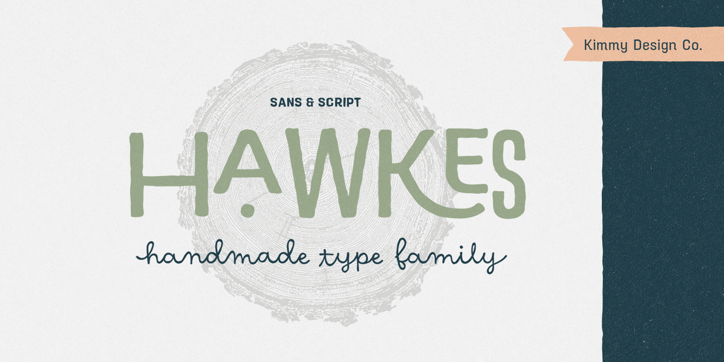
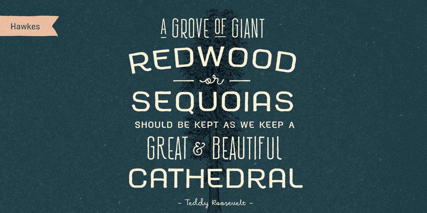
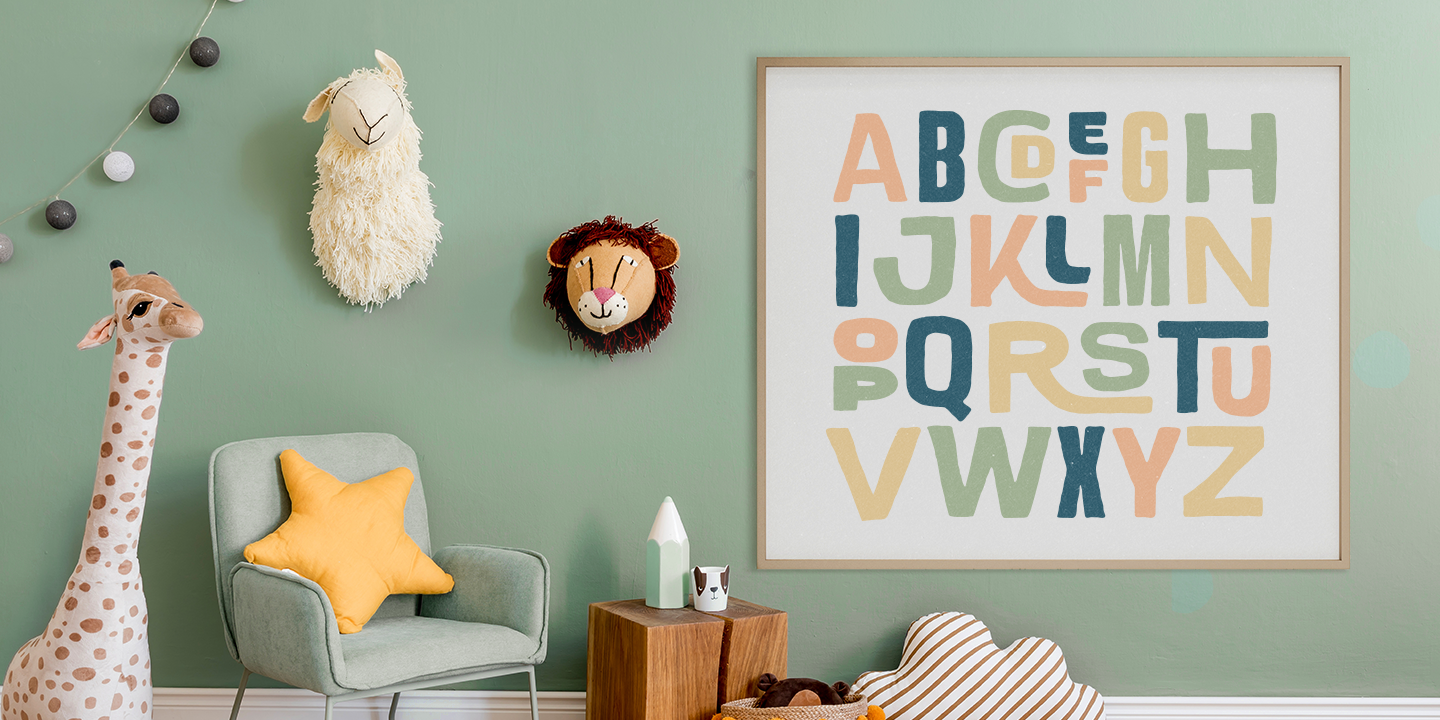
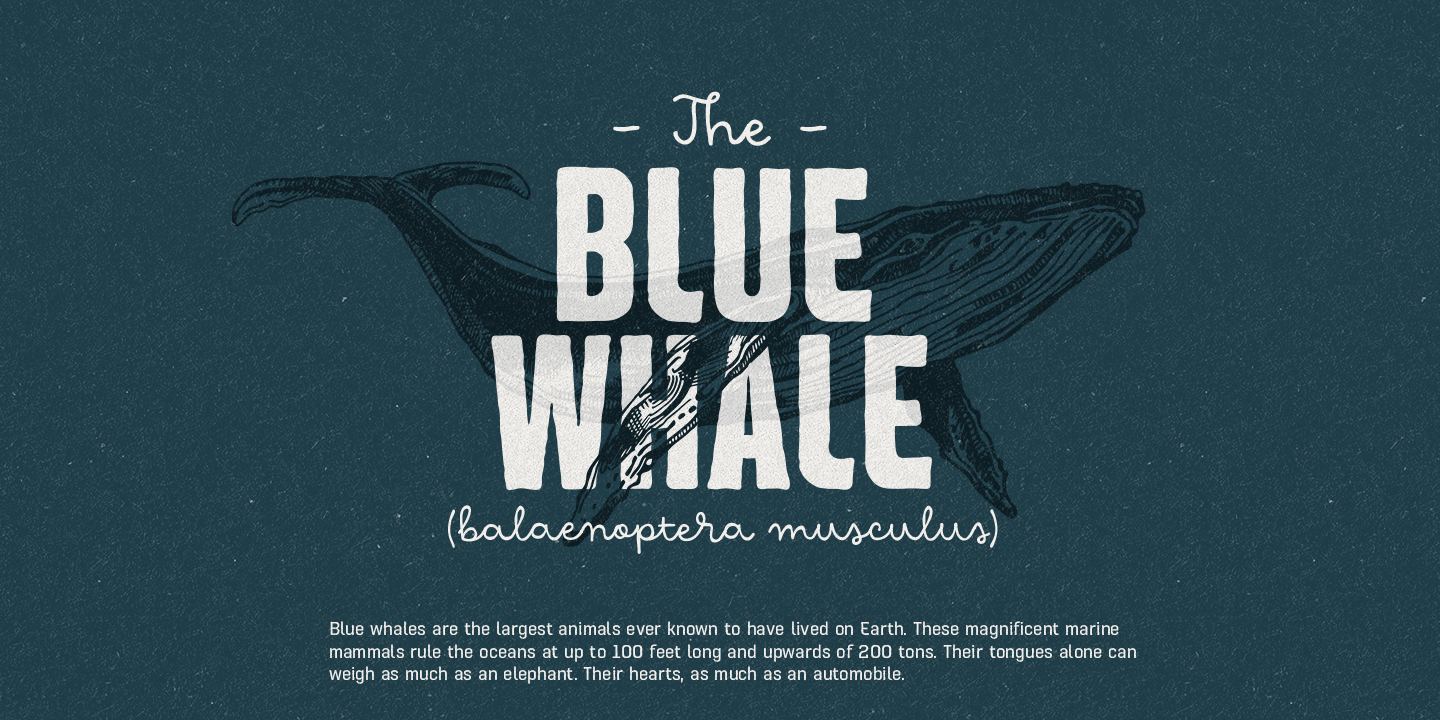
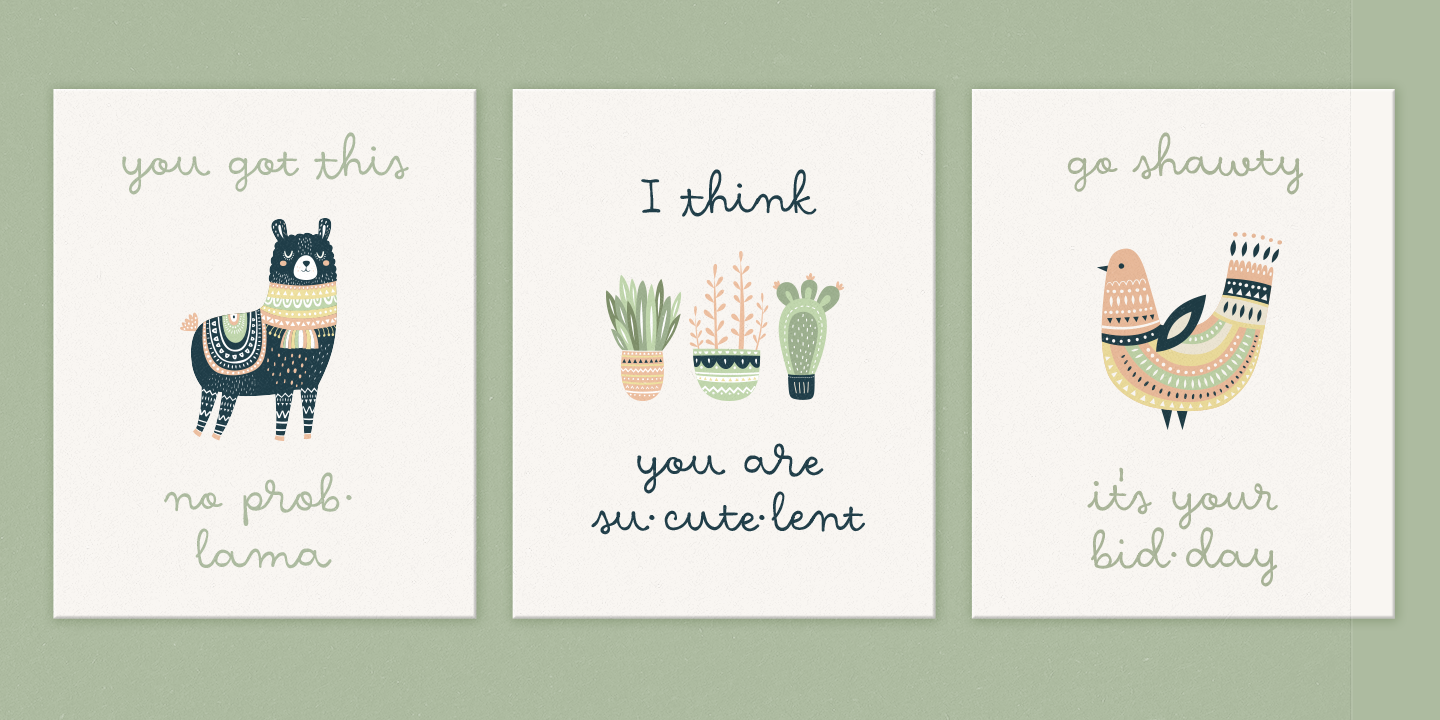
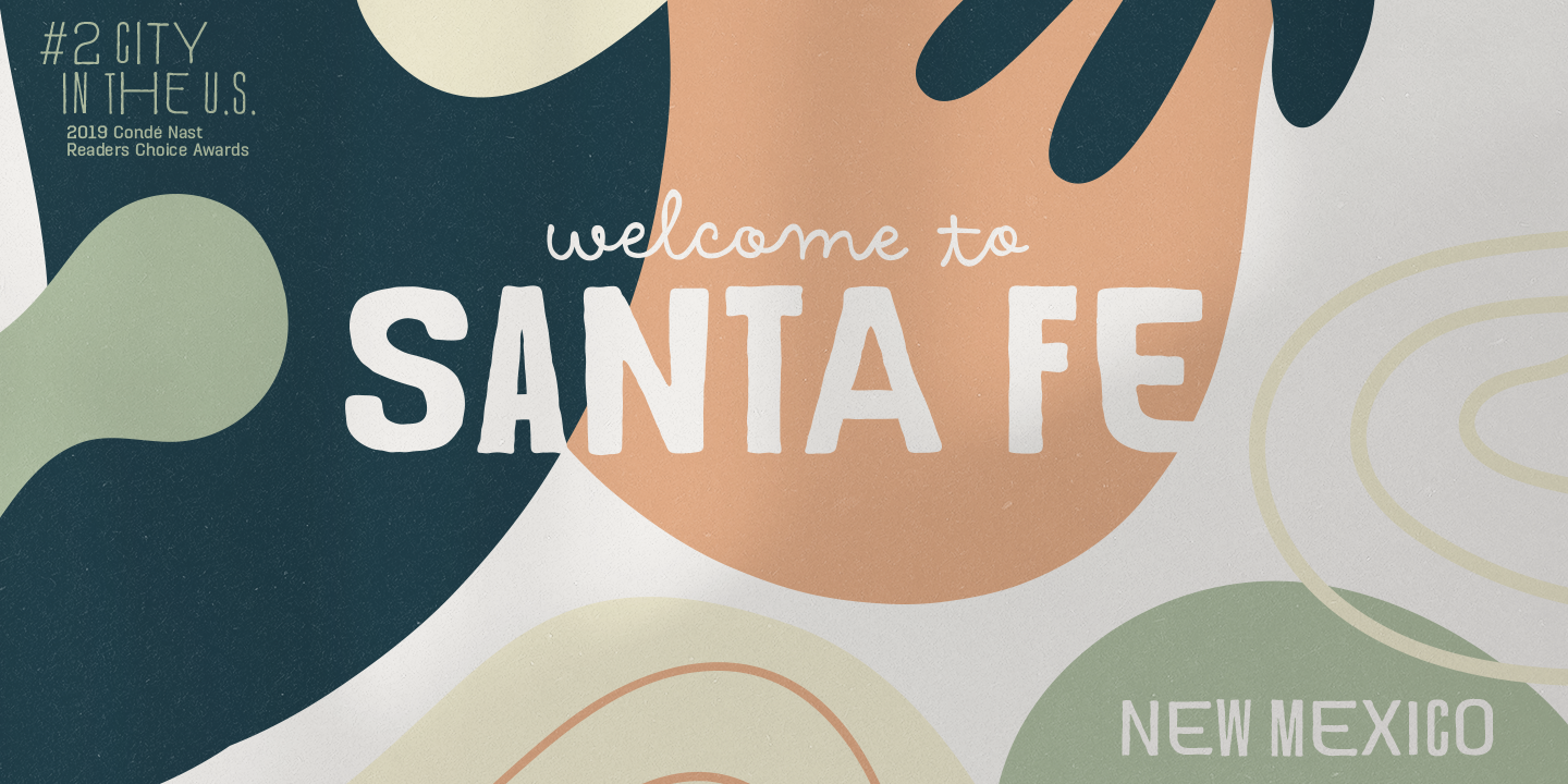
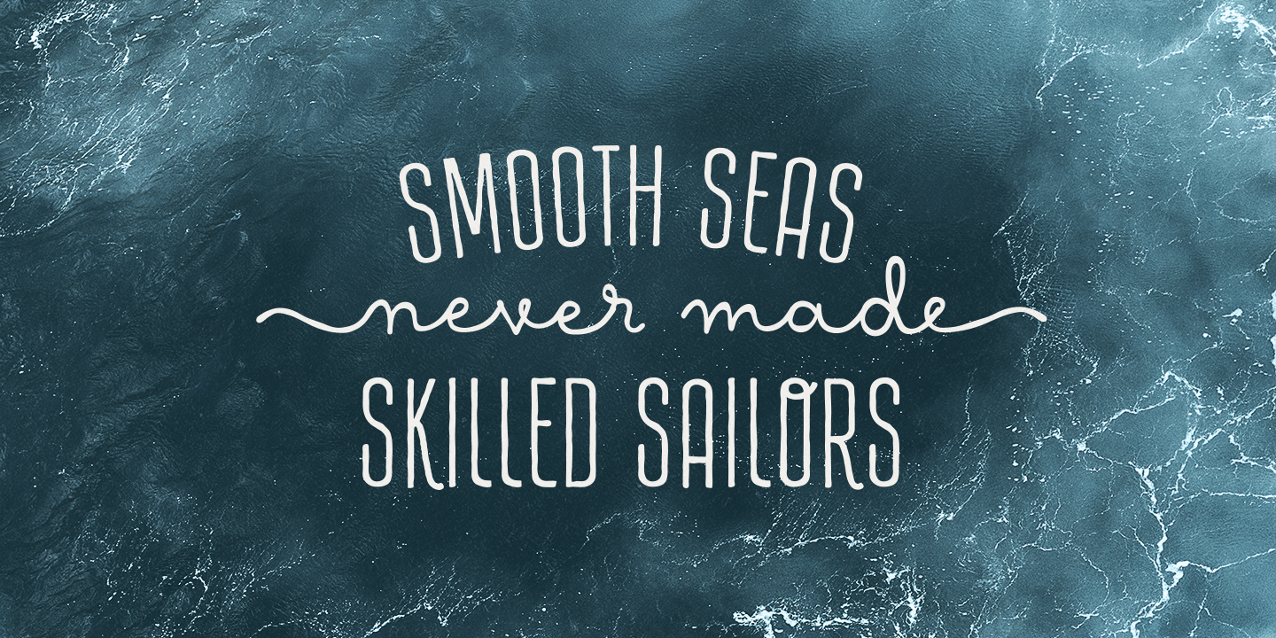
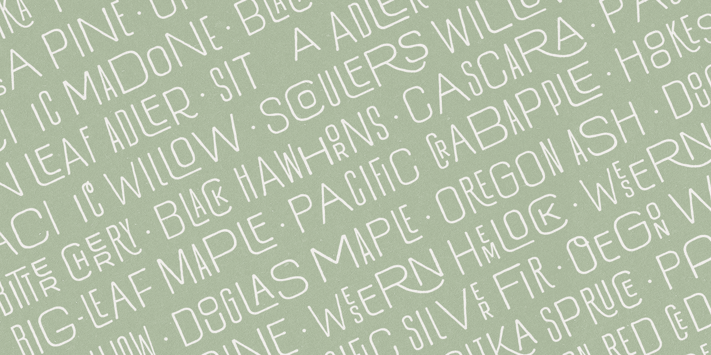
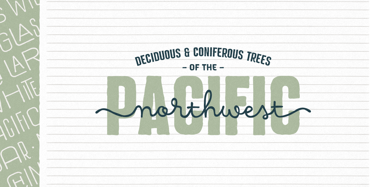
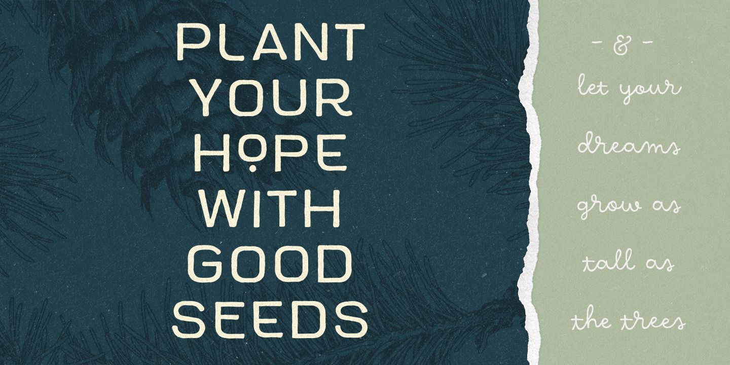
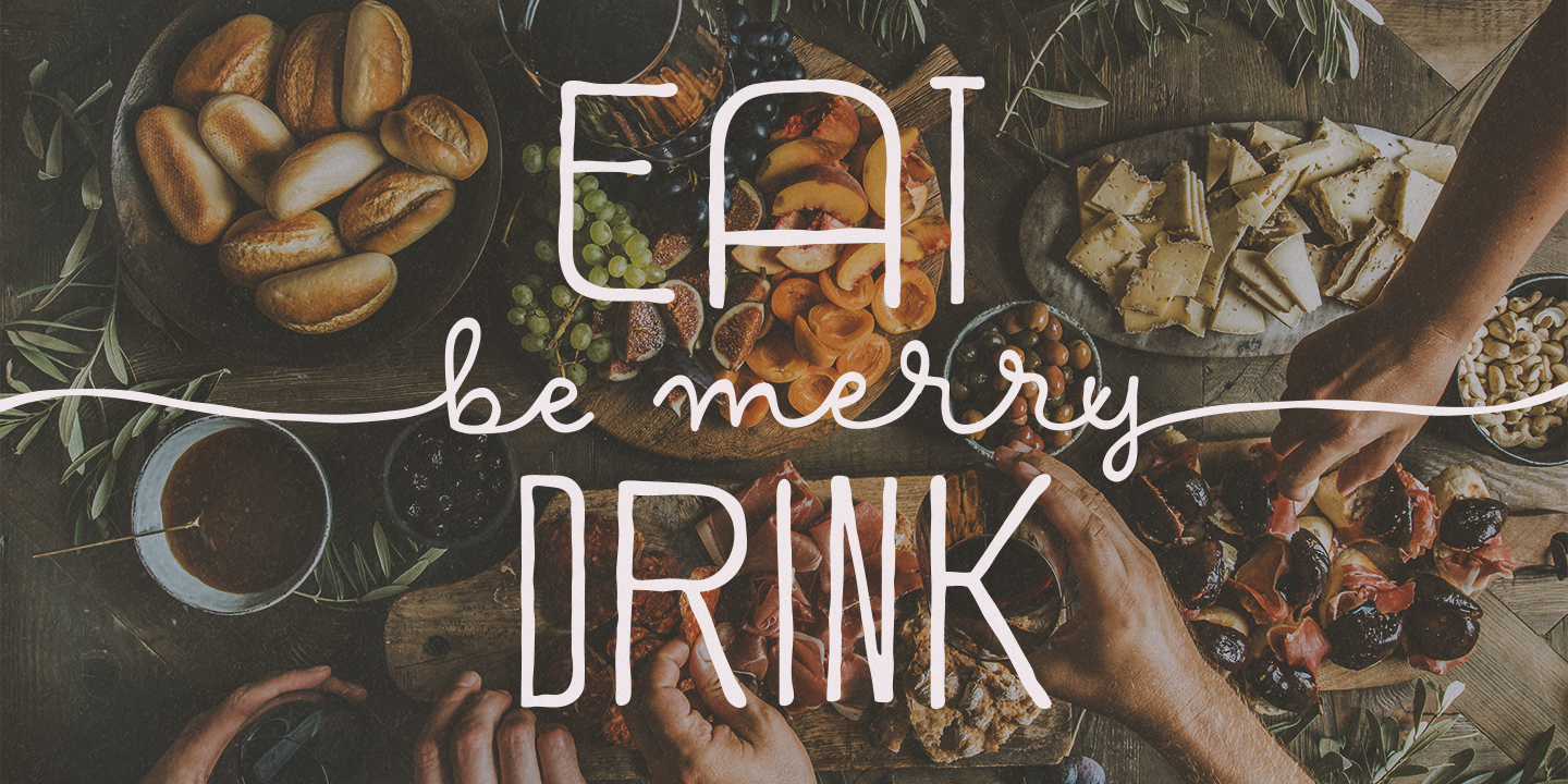
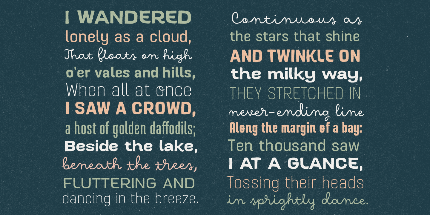
Hawkes is an extensive handmade typeface family that comes with a bundle of weights, widths and styles, all designed to work cohesively. Here is a breakdown of the Hawkes family. Hawkes Sans: The primary subfamily is a sans-serif typeface that includes nine fonts: three weights (light, medium and bold) and three widths (narrow, regular and wide). Within this set are an array of stylistic features; including small capitals, character style alternatives, discretionary ligatures and contextual alternatives. See details below for more information on OpenType Features. Hawkes Variable Width Sans: The secondary subfamily is the same base sans-serif fonts but combined in variating widths. Essentially, it takes all three widths of each weight and randomly mixes them together. This creates a funky and creative alternative to the more traditional sans-serif set. The variations are for the uppercase, lowercase, small capitals, ligatures and numbers. Hawkes Script: The last subfamily is the script typeface. It’s a quirky script with variations of its own, including ligatures, swashes and contextual alternatives (again, see below for further details.) The script font works great as a complimentary style to the sans-serif, or on it’s own. FEATURES Alright, let’s get into all the extra goodies this typeface has to offer. Small Capitals: Small caps are short capital letters designed to blend with lowercase text. These aren’t just capital letters just scaled down but designed to fit with the weight of both the lowercase and capitals. With Hawkes, small caps can either sit on the baseline (in line with the base of the capital and lowercase) or to be lifted to match the height of the capital letters by applying the discretionary ligature setting in the OpenType panel. These small capitals have a dot underlining them that sit along the baseline. The feature offers a unique display affect that is great for logos, titles and other headline needs. Discretionary Ligatures: A discretionary ligature is more decorative and unique combination than a standard ligature and can be applied at the users discretion (as the name indicates.) The specific styling for these ligatures varies for different fonts. With Hawkes, they are used as an all capital styling feature, or to lift the small capitals to align with the height of the capitals. In the former setting, both lowercase and uppercase letters are first changed to all capitals, then a specialized set of letter combinations are transitioned so small characters are positioned within a main capital letter. These combinations only happen with main characters that include an applicable stem, such as C F K L R T Y. Some of these combinations include two or three characters. When Small Caps is turned ‘on’, this feature will lift the small caps to the height of the capital letter. For more information, please check out the user guide! Stylistic Alternatives: Stylistic alternates are a secondary form of a character, often used to enhance the look or style of a font. For Hawkes, these alternatives provide a slightly more handmade feel. A - the capital and small capital A will lose its pointed apex and become rounded. Think of it more as an upside-down U than an up-side-down V ;-) Oo, G, Ss, Cc- these characters’ topmost terminal becomes a loop. The O is applied automatically, the G S and C need to be turn on individually. Titling Alternatives: This feature does sort of the opposite of what it intends. Instead of being used for titling purposes, this feature makes the text look better in paragraph text settings. Kk Rr h n m - curved terminals on the are straightened e - the counter stroke also gets straightened from a more looping motion y - the shape of y is changed from a rounded character to a sharper apex (think more like a ‘v’ than ‘u’) Contextual Alternatives: Contextual alternates are glyphs designed to work within context of other adjacent glyphs. With Hawkes Sans, there are three slightly different variations per character. The feature rotates the application of each variation. This helps with organic authenticity, so if you have two e’s next to each other, they won’t look identical (reflecting the natural variations in handwriting and lettering.) With Hawkes Variable width fonts, I have created a contextual pattern that randomizes the widths of each character. So, when the feature is turned ‘on’ in the OpenType panel, the widths would alternate in a pattern such as: Narrow, Wide, Regular, Narrow, Regular Wide, Narrow, etc. It happens automatically so the user doesn’t have to think or worry about getting a random seed. With Hawkes Script, contextual alternates allow strokes to connect properly from one character to the next while maintaining a believable, natural flow. Connecting strokes are present for two letters next to each other but are replaced by a shorter stroke when located at the end of a word or sentence. Some characters have in-strokes when located at the start of a word. When a character is preceded by a capital letter that doesn’t connect, it too needs an in-stroke or altered spacing. This feature is complicated and messy, but luckily you don’t really have to think about it! I’ve done all the coding so all you have to do is turn ‘on’ the feature in the OpenType panel and you are off to the races! I’m just letting you know what’s happening behind the scenes. Swashes: These are just for Hawkes Script and provide tail swashes to the start and ends of letters. There are three different options. You can pick the basic option by turning ‘on’ the swash feature in the OpenType panel, or you can pick using the Glyph panel. Stylistic Sets: This feature work in new versions of Illustrator CC and InDesign CC. You can pick specific styling sets instead of turning on an entire feature. For example, let’s say you want to have a loopy S, but not a loopy C or O, you can just turn on the S in the Style Set. It also helps create the little drop box that pops up when you hover over a character, showing you the alternates associated with that character. This makes it easy to pick and choose specific styles you want in a word or headline. ---------- And there it is folks! That’s all the basic info on Hawkes, I know it’s been a lot and I appreciate you hanging on. If you are like me and need more of a visual reference to accessing all these goodies, I’ve made a user guide to help navigate Hawkes and everything it has to offer. Altogether this extensive family boasts 14 total fonts in a wide array of styles, weights and widths, making it a great addition to any handmade type collection. Enjoy!
许可类型
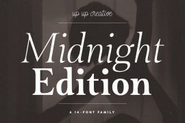
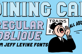
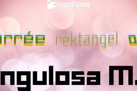
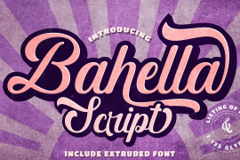
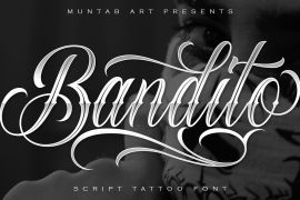
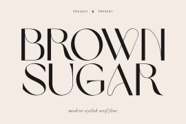
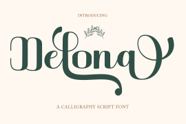
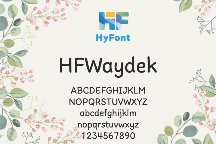
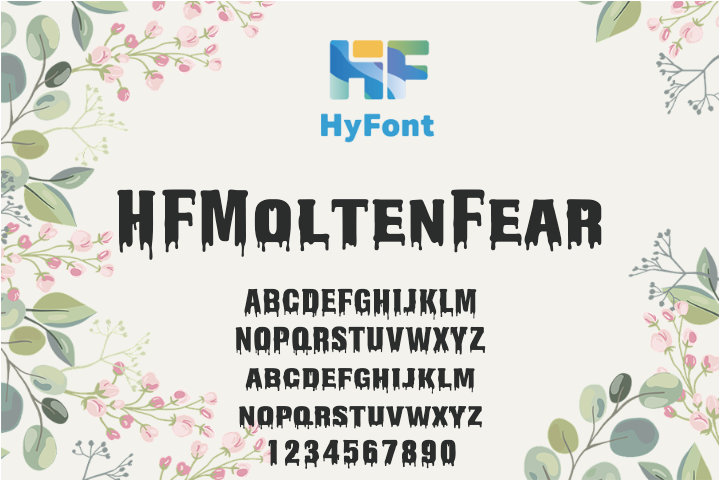
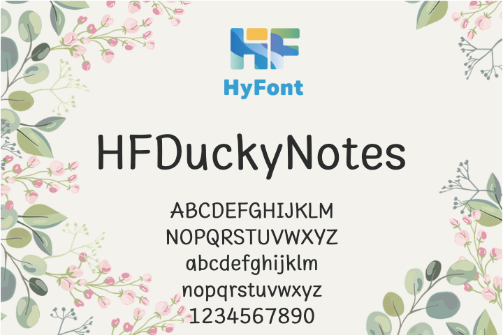
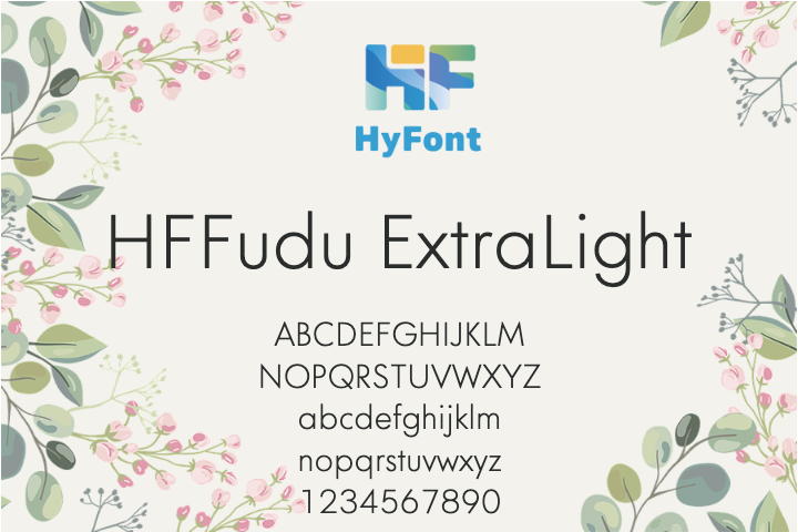
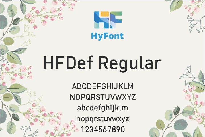
字形展示
授权流程
线上全程自助授权
正版承诺
该字体由福州字谷科技有限公司代购

授权证明
官方出具授权证明,可在“个人中心-我的订单”查看或下载(付款后2个工作日内发货)
正规发票
每笔产生实际支付的订单都能在线申请开具增值税发票。
票
样
本

开票流程
1.在订单列表内点击“申请开票”
2.选择或新增您的“发票抬头”
3.提交申请
发票类型
1. 电子增值税普通发票,税率:1%
2. 电子增值税专用发票,税率:1%
发票内容:信息技术服务费
注:电子发票发送到您的电子邮箱,电子票据与纸质票据具有同等法律效力。
常见问题
1.代购商品已下架或暂时无价格怎么办
代购商品页面出现“代购方商品已下架”、“暂时无价格”、“正在更新价格”等提示,是因为远程服务器读取失败造成的,请您联系在线客服或微信客服18610955775获取详细报价。
2.海外字体常见的授权方式
桌面授权(Desktop)
“桌面”指的是计算机,桌面授权允许您将字体安装在计算机上,用于离线设计用途,包括设计Logo、海报、商品、杂志等,比如您在计算机上使用字体设计的静态图片是允许您随意传播的(不论线上、线下都可以使用);但不能将字体文件以任何形式嵌入您的作品,也就是说字体文件不能离开您的计算机,比如说将字体转换格式后嵌入网页或者在PPT中嵌入字体后进行传播都是不允许的;需要注意的是有些版权方可能会额外规定不允许将字体用于设计LOGO等指定用途,具体以版权方的规定为准。
该授权通常按用户数量进行授权,用户数指的是有可能安装该字体的电脑数量;桌面授权一般是永久有效的,如有指定年限我们的购买页面都会有所提示;授权有效期内设计的作品是可以永久使用的,但授权有效期外还需要继续使用字体进行设计的话需要重新购买授权。
网页授权(Webfont)
网页授权顾名思义就是允许将字体文件嵌入到各类网页中的一种授权方式,不论字体文件是否经过转换格式,也不论是完整嵌入或是部分嵌入,字体文件以任何形式嵌入网页都需要取得该授权。
不同版权方对于网页授权的售卖方式有所差别,除了按授权期限售卖之外,一般还会规定授权期限内的总浏览量或每月浏览量,您可以根据您的网站需求选择购买,购买授权后若遇浏览量超出预期的可重复购买。
应用授权(App)
应用授权允许您将字体文件嵌入到您开发或运营的APP中,不论是游戏APP、教育APP、音乐APP,任何APP只要嵌入了字体文件都需要取得该授权。
应用授权可按照授权期限、装机量、APP数量等多种形式售卖。
电子书授权(ePub)
电子书授权允许将字体文件嵌入到电子出版物中,但是运行电子出版物的操作系统中不能安装字体软件。
该授权可按照授权期限、书目数量、设备总量、浏览量等多种形式售卖。
服务器授权(Server)
服务器授权允许您将字体以无法被提取的方式安装在被授权的服务器上,但不能在任何其他计算机或处理单元上安装字体。
该授权可按照授权期限、CPU核心数、客户端数量等多种形式售卖。
数字广告授权(Digital Ads)
数字广告授权允许您访问、下载和使用Web字体工具包中提供的Web字体,以便创建数字广告,但是仅用于在输出设备上发布数字广告。
该授权可按照按照授权期限、发布数量、曝光数量等多种形式售卖。
3.代购订单的授权何时生效
您完成付款后,服务商会在第一时间为您采购相关授权,授权流程通常会在24小时内完成,采购完成后您可以在订单详情中查看授权凭证并下载字体文件或申请开具发票。
4.广告公司为客户设计作品由谁购买字体授权
通常字库软件使用许可的“被许可方”应为设计方案的最终使用方,因此设计方案的业主单位必须获得所使用字体的相关授权,此外有些授权方式(如桌面授权)规定了使用终端的数量,那么所有使用该字体进行设计或者修改方案的计算机均需要获得授权。
5.如何帮客户购买授权
您提交订单时可以选择或者新增“被许可方”信息,在“被许可方”的表单内填写您的客户信息即可。
6.怎么安装字体
Windows系统:直接将字体文件复制到C:\Windows\Fonts,或者鼠标右键单击字体文件,选择“安装”即可;Mac系统:双击字体文件-点击安装,或者打开“应用程序”-“字体册”,将字体拖进去即可。
7.字体安装后在PS等软件中找不到怎么办
由于操作系统或者软件版本的原因,如果您在软件中找不到安装的字体,建议您先重启系统,该字体在列表中显示的可能为中文或英文名称,请您认真查找,只要字体安装成功,字体列表里就一定存在该字体。
8.支付过程出现风险提示怎么办
使用微信、支付宝等第三方支付工具进行大额支付时,有可能触发风险提示,请根据以下方法进行操作,您也可以通过企业对公转账的方式支付大额订单;


- wide
- narrow
- poster
- hand
- comic
- rough
- light
- logo
- handwriting
- headline
- organic
- magazine
- books
- handcraft
- illustration
- italic
- swashes
- dark
- handstyle
- handmade
- kids
- drawn
- handcrafted
- handwritting
- fun
- display
- regular
- authentic
- hand-drawn
- hand-tooled
- small caps
- hand script
- handwritten
- condensed
- children
- handlettered
- variable
- playful
- handlettering
- hand drawn
- family
- handdrawn
- packaging
- lowercase
- ligature
- opentype
- hand written
- hand lettered
- hand-written
- handrawn
- written
- collection
- hand-made
- hand made
- hand-lettered
- hand writing
- hand-draw
- expanded
- hand lettering
- discretionary ligatures
- illustrated
- children books
- lighthearted
- extras
- kids books
- features
- handw-ritten
- handwriting font
- handwritten font
- bundle
- hand display
- hand made font
- handmade font
- handdrawn sans
- handdrawn sans serif
- hand-drawn sans
- hand-drawn sans serif
- hand drawn sans
- hand drawn sans serif
- 2020trend
- playroom
- illustration books
- ed2020
- casual
- decorative
- heading
- legible
- casual script
- brush
- retro


 京公网安备11010802038756号