

 正版商用
正版商用
 官方授权
官方授权
 正规发票
3个工作日
正规发票
3个工作日 
字体描述
Neue Haas Unica by Toshi Omagari:
The original purpose behind the creation of the typeface Haas Unica was to provide a sympathetic update of Helvetica. But now the font designer Toshi Omagari has decided to make this typeface his own and has thus significantly supplemented and extended it.
In the late 1970s, at the same time at which hot metal typesetting was being replaced by phototypesetting, the Haas Type Foundry commissioned a group of specialists known as "Team '77" consists of Andre Gurtler, Christian Mengelt and Erich Gschwind to adapt Max Miedinger's font
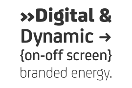
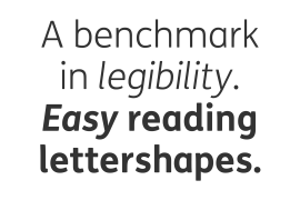
The characters of Haas Unica are somewhat narrower than those of Helvetica so that the larger bowls, such as those of the "b" and "d", appear more delicate and have a slightly more pleasing effect.
In general, the spacing of Haas Unica was increased to provide for improved kerning and thus enhance the legibility of the typeface in smaller point sizes. Major changes were made to the lowercase "a", in that the curve of the upper bowl became rounder and its spur was eliminated. The form of the "k" was additionally modified to remove the offset leg so that both diagonals originate from the main stem. The outstroke of the uppercase "J" was also significantly curtailed.
In addition to many minor alterations, such as to the length of the horizontal bars of the "E", "F" and "G" and to the angle of the tail of the "Q", the leg of the "R" was extended and made more diagonal.
In the case of the numerals, the upper curve of the "2" was reduced and the lower loops of the "5" and "6" were correspondingly adapted. The sweep of the diagonal of the "7" was also reduced.
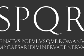
Several decades later, Toshi Omagari returned to the original sketches with the objective of reinvigorating this almost totally forgotten typeface. First, however, he needed to revise the drafts prepared by Team '77 to adapt them for digital typesetting. So Omagari carefully adjusted the proportions of the glyphs, achieving a more uniform overall effect across all line weights and removed details that had become redundant for contemporary typefaces. It was also apparent from the old drafts that it had been the case that the original plan was to create more than the four weights that were published. Omagari has added five additional styles, giving his Neue Haas Unica? a total of nine weights, from Ultra Light to Extra Black.
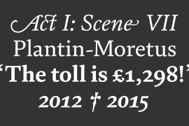
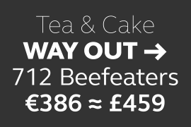
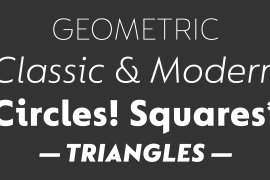
He has also greatly extended the range of glyphs. Providing as it does typographic support for Central and European languages, Greek and Cyrillic texts, Neue Haas Unica is now ready to be used for major international projects. In addition, it has been supplied with small caps and various sets of numerals.
With its resolute clarity and excellent typographic support, Neue Haas Unica is suitable for use in a wide range of new contexts. The light and elegant characters can be employed in the large point sizes to create, for example, titling and logos while the very bold styles come into their own where the typography needs to be powerful and expressive. The medium weights can be used anywhere, for setting block text and headlines.
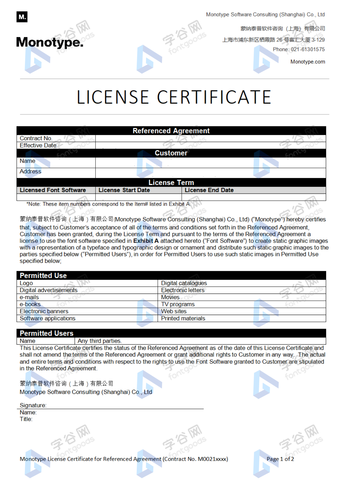
许可类型
|
许可名称
|
许可描述
|
许可协议原文(英文)
|
|
|---|---|---|---|
|
桌面
|
在Windows或macOS安装字体,在桌面应用程序使用字体(包括:Photoshop、Illustrator、CorelDRAW、Word等),创建和打印文档以及静态图像。多数情况下,可在徽标/商标、产品包装、宣传物料、新媒体、网站、应用程序当中使用这些图像。
|
授权流程
线下授权
官方授权
本店所有字体均由Monotype官方授权字谷网代理销售
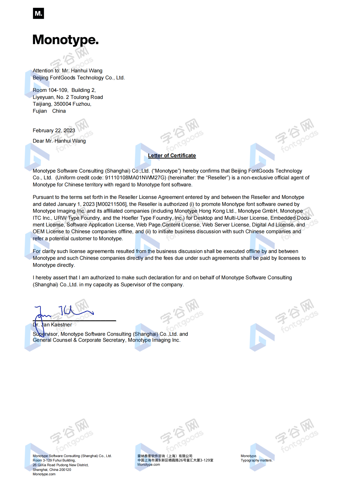
授权证明
Monotype官方出具授权证明
正规发票
每笔产生实际支付的订单都能在线申请开具增值税发票。
票
样
本

开票流程
1.在订单列表内点击“申请开票”
2.选择或新增您的“发票抬头”
3.提交申请
发票类型
1. 增值税普通发票,税率:6%
2. 增值税专用发票,税率:6%
发票内容:信息技术服务费
注:电子发票发送到您的电子邮箱,电子票据与纸质票据具有同等法律效力。
常见问题
1.广告公司为客户设计作品由谁购买字体授权
通常字库软件使用许可的“被许可方”应为设计方案的最终使用方,因此设计方案的业主单位必须获得所使用字体的相关授权,此外有些授权方式(如桌面授权)规定了使用终端的数量,那么所有使用该字体进行设计或者修改方案的计算机均需要获得授权。
2.如何帮客户购买授权
您提交订单时可以选择或者新增“被许可方”信息,在“被许可方”的表单内填写您的客户信息即可。
3.怎么安装字体
Windows系统:直接将字体文件复制到C:\Windows\Fonts,或者鼠标右键单击字体文件,选择“安装”即可;Mac系统:双击字体文件-点击安装,或者打开“应用程序”-“字体册”,将字体拖进去即可。
4.字体安装后在PS等软件中找不到怎么办
由于操作系统或者软件版本的原因,如果您在软件中找不到安装的字体,建议您先重启系统,该字体在列表中显示的可能为中文或英文名称,请您认真查找,只要字体安装成功,字体列表里就一定存在该字体。
5.支付过程出现风险提示怎么办
使用微信、支付宝等第三方支付工具进行大额支付时,有可能触发风险提示,请根据以下方法进行操作,您也可以通过企业对公转账的方式支付大额订单;


- legible
- clean
- heading
- ads
- advertisment
- advertisments
- anniversary
- announcements
- architect
- architectural
- balanced
- beautiful
- birthday
- book
- building
- business cards
- calm
- casual
- catalogs
- catalogues
- ce
- central european
- classic
- clear
- cool
- dictionaries
- dictionary
- elegant
- encyclopaedia
- encyclopedia
- family affairs
- film titling
- fine
- fresh
- funeral
- headline
- instructions
- intelligent
- invitation
- lexica
- listings
- magazine
- manuals
- maps
- marriage
- menus
- modern
- neutral
- newsletters
- newspaper
- opentype
- optimistic
- ot
- pro
- professional
- readable
- refined
- sans serif
- screen
- smooth
- technical
- text
- timeless
- universal
- versatile
- warm
- wedding


 京公网安备11010802038756号